❮

❯
I Dream, You Dream, We All Dream of Ice Cream
New Logo and Identity for Snooz by How&How
Reviewed Feb. 24, 2026

Premiering their first batch of orders in February 2026, Snooz is a London, UK-based ice cream which aims to promote sleep hygiene. It’s a novel concept for a frozen dessert, swapping out sugar and emulsifiers for an adaptogen-forward mix of camomile, theanine, magnesium, and lemon balm to reduce blood sugar spikes which can disrupt healthy sleeping habits. The brand is soft-launching with a single flavor offering of vanilla and will be rolling out additional flavors such as chocolate and salted caramel in the coming months. The brand identity for Snooz was concocted by the London office of How&How.

Read the full article at Brand New
Adobe MAX 2024 by Play Affinity done In-house Bombardier by Lippincott Brompton House by UnitedUs Canva Create 2025 done In-house Daylight Computer Company by The Office of Ordinary Things Docusign done In-house Elica by Landor Elodie by Koto F.C. København by Kontrapunkt Fhirst by Mother Design FIDE 2021 World Chess Championship by Morillas Flow Power by Self–titled Gobi Cashmere by Mucho Grand Palais by Base Design GSK by Wolff Olins GUT by &Walsh Intrinsic by Pentagram 57th Karlovy Vary International Film Festival by Studio Najbrt Kentucky Bourbon Trail by Lewis Kimberly-Clark by Someoddpilot La-Z-Boy by Colle McVoy Lex by &Walsh Lobe by FAY Marin Living Foods by The Working Assembly Marshmallow by Ragged Edge Mundo Chachapoyas by Studioa Norwegian by Try Design NVRD by Airsolid Outschool by Geist Saintly by Universal Favourite SATREV by Symbol Studio Seattle Reign FC by Redscout Shop by Porto Rocha SK Rapid Vienna by Beyer Görges Starburst by Straight Forward Design Sigma by Stockholm Design Lab Snooz by How&How Sommerro by Bielke&Yang Son of a Tailor by Ragged Edge TBWA by Plau, Fuze, and In-house The Beams by Only Viva by ILLO Studio
All Work and No Palais
New Logo and Identity for Grand Palais by Base Design
Reviewed Jan. 20, 2026

Nestled on the bank of the Seine and just down the Champs-Élysées from the Arc de Triomphe, the Grand Palais is a 775,000 square foot (or, in its native units, 72,000 square meter) exhibition hall complex in Paris, France. Originally constructed in 1897 as a venue for the 1900 Paris Exposition, it stands to this day as a monument to the French artistic sensibility and the grandeur of the Beaux Arts architectural movement. Its classical stone columns and ornate steel framework support a massive, barreled glass canopy roof which, over a century later, is still the largest in Europe.

The complex has been in near-continuous use since its debut to the public at the 1900 Paris Exposition, where it served as the main hall for festivities and introduced international audiences to many early electrical innovations, such as talking films, trolleybuses, and some of the first electric cars. It hosted artistic events and museum collections, and during World War I it was employed as a military hospital. It’s iconic status as a landmark of French culture has seen it used in sporting events, including the 2017 Tour de France and the fencing and taekwondo segments of the 2024 Olympic Games.

In March of 2021, the Grand Palais was closed to the public for major renovations. The $455 million (or, in its native currency, €466 million) project served to repair damage to the northern wing which had been lingering since the second World War, as well as adding a new public entrance, 40 elevators, 30 staircases, and increasing the overall capacity of the space by 140%.

The public reopening of the space in July 2025 also saw the debut of a new brand identity and strategy introduced by the Brussels, Belgium branch of the international design studio Base Design.


Read the full article at Brand New
Adobe MAX 2024 by Play Affinity done In-house Bombardier by Lippincott Brompton House by UnitedUs Canva Create 2025 done In-house Daylight Computer Company by The Office of Ordinary Things Docusign done In-house Elica by Landor Elodie by Koto F.C. København by Kontrapunkt Fhirst by Mother Design FIDE 2021 World Chess Championship by Morillas Flow Power by Self–titled Gobi Cashmere by Mucho Grand Palais by Base Design GSK by Wolff Olins GUT by &Walsh Intrinsic by Pentagram 57th Karlovy Vary International Film Festival by Studio Najbrt Kentucky Bourbon Trail by Lewis Kimberly-Clark by Someoddpilot La-Z-Boy by Colle McVoy Lex by &Walsh Lobe by FAY Marin Living Foods by The Working Assembly Marshmallow by Ragged Edge Mundo Chachapoyas by Studioa Norwegian by Try Design NVRD by Airsolid Outschool by Geist Saintly by Universal Favourite SATREV by Symbol Studio Seattle Reign FC by Redscout Shop by Porto Rocha SK Rapid Vienna by Beyer Görges Starburst by Straight Forward Design Sigma by Stockholm Design Lab Snooz by How&How Sommerro by Bielke&Yang Son of a Tailor by Ragged Edge TBWA by Plau, Fuze, and In-house The Beams by Only Viva by ILLO Studio
To Affinity and Beyond
New Logo and Identity for Affinity done In-house
Reviewed Nov. 6, 2025

Launched at the end of October 2025, Affinity is a desktop graphic editing and publishing program from Canva. While the Affinity software is technically a brand new entity unto itself, it emerged last Wednesday out of a decade of prior development in the field. The first software bearing the Affinity name was originally developed by Serif Europe in 2014, and from the beginning it has always and unavoidably occupied a space in the digital art and design world opposite the industry standard, Adobe.

Affinity Designer was an Illustrator-esque vector graphics editor released in October 2014 under a perpetual license. This came a year after Adobe announced the end of their own Creative Suite perpetual licensing model to go all-in on Creative Cloud, a monthly subscription model which is still in place to this day. In the coming years, Serif kept the ball rolling with similar programs fashioned as Adobe Adobe MAX 2024 by Play Affinity done In-house Bombardier by Lippincott Brompton House by UnitedUs Canva Create 2025 done In-house Daylight Computer Company by The Office of Ordinary Things Docusign done In-house Elica by Landor Elodie by Koto F.C. København by Kontrapunkt Fhirst by Mother Design FIDE 2021 World Chess Championship by Morillas Flow Power by Self–titled Gobi Cashmere by Mucho Grand Palais by Base Design GSK by Wolff Olins GUT by &Walsh Intrinsic by Pentagram 57th Karlovy Vary International Film Festival by Studio Najbrt Kentucky Bourbon Trail by Lewis Kimberly-Clark by Someoddpilot La-Z-Boy by Colle McVoy Lex by &Walsh Lobe by FAY Marin Living Foods by The Working Assembly Marshmallow by Ragged Edge Mundo Chachapoyas by Studioa Norwegian by Try Design NVRD by Airsolid Outschool by Geist Saintly by Universal Favourite SATREV by Symbol Studio Seattle Reign FC by Redscout Shop by Porto Rocha SK Rapid Vienna by Beyer Görges Starburst by Straight Forward Design Sigma by Stockholm Design Lab Snooz by How&How Sommerro by Bielke&Yang Son of a Tailor by Ragged Edge TBWA by Plau, Fuze, and In-house The Beams by Only Viva by ILLO Studionts. Affinity Photo, a Photoshop alternative, came out in July 2015, followed by the InDesign competitor Affinity Publisher in June 2019. Each program was priced at $49.99 for full ownership of the software, which was equal to what Adobe was charging per month under an annual commitment when Creative Cloud began.

While initially a little rough around the edges, the Affinity suite garnered goodwill among their base by releasing free software updates, adding familiar features and making the transition to their platform smoother. Publisher gained the ability to import InDesign IDML files in 2019, and Photo learned how to read PSD files with smart objects in 2020. Meanwhile, resentments towards Adobe grew as the company was being investigated by the FTC for deceptive subscription billing practices and hiding early termination fees. The first half of the 2020s was littered with articles and videos about how to abandon the Adobe ship, and Affinity had built themselves into one of the foremost safe harbors of the era.

Serif and the Affinity suite eventually grew large enough to catch the attention of Canva, a freemium online graphic design platform targeted at small businesses and individuals. Serif was worth an estimated $4.6 million in March 2024 when Canva purchased them and the rights to the Affinity suite for around $1 billion. This was a tense clash of two seemingly conflicting philosophies. Founded a year before Serif in 2013, Canva had spent their decade eating into the Adobe dynasty in their own way by democratizing the design process with beginner-friendly templates and an AI-forward approach which circumvented the need for specialized creative expertise. This tension was palpable enough that Canva took it upon themselves to publish The Affinity and Canva Pledge, in which they committed themselves to honoring all existing perpetual licenses and to the ongoing development of Affinity as software for professional designers.

On October 1 2025, Canva suspended the ability to make new purchases of any Affinity software and replaced the Affinity homepage with the cryptic message “Creative Freedom is Coming,” suggesting that a restructuring of the software was imminent. And finally, last Wednesday, October 29, Canva announced the new structure. First, the individual Affinity Designer, Affinity Photo, and Affinity Publisher apps would be phased out in favor of one cohesive Affinity app, capable of the functionality of all three prior programs. Second, the software would be switching from a perpetual license model to a new freemium pricing structure. All the prior functionality from the paid versions and any future updates to the core design software will be, according to Canva, “completely free, forever.” Users with a paid Canva premium account will be able to unlock a new suite of AI tools, which have been built into the program in their own separate section. Accompanying this announcement was a new logo and identity created by Canva’s in-house team, Canva Creative.


Read the full article at Brand New
Adobe MAX 2024 by Play Affinity done In-house Bombardier by Lippincott Brompton House by UnitedUs Canva Create 2025 done In-house Daylight Computer Company by The Office of Ordinary Things Docusign done In-house Elica by Landor Elodie by Koto F.C. København by Kontrapunkt Fhirst by Mother Design FIDE 2021 World Chess Championship by Morillas Flow Power by Self–titled Gobi Cashmere by Mucho Grand Palais by Base Design GSK by Wolff Olins GUT by &Walsh Intrinsic by Pentagram 57th Karlovy Vary International Film Festival by Studio Najbrt Kentucky Bourbon Trail by Lewis Kimberly-Clark by Someoddpilot La-Z-Boy by Colle McVoy Lex by &Walsh Lobe by FAY Marin Living Foods by The Working Assembly Marshmallow by Ragged Edge Mundo Chachapoyas by Studioa Norwegian by Try Design NVRD by Airsolid Outschool by Geist Saintly by Universal Favourite SATREV by Symbol Studio Seattle Reign FC by Redscout Shop by Porto Rocha SK Rapid Vienna by Beyer Görges Starburst by Straight Forward Design Sigma by Stockholm Design Lab Snooz by How&How Sommerro by Bielke&Yang Son of a Tailor by Ragged Edge TBWA by Plau, Fuze, and In-house The Beams by Only Viva by ILLO Studio
If At First You Don’t Seceed…
New Identity for SK Rapid Vienna by Beyer Görges
Reviewed Oct. 16, 2025

Founded in 1897 as the Erster Wiener Arbeiter-Fußball-Club (First Viennese Workers’ Football Club) and arriving at their current and much snappier name in 1899, Sportklub Rapid Vienna is among Austria’s oldest active football clubs.

The club has seen a variety of changes over the past 126 years while firmly planting their feet in the Hütteldorf neighborhood of Vienna, playing at Gerhard Hanappi Stadium from 1977 through 2014 before moving to the Allianz Stadion in 2016. With 32 Austrian championship titles, they are the top titleholding team in the country and have maintained a record of wins that have continued unhindered through both world wars and a Nazi occupation. This most recent refresh comes courtesy of Dortmund, Germany-based Beyer Görges, who developed a new identity system and website for the team.


Read the full article at Brand New
Adobe MAX 2024 by Play Affinity done In-house Bombardier by Lippincott Brompton House by UnitedUs Canva Create 2025 done In-house Daylight Computer Company by The Office of Ordinary Things Docusign done In-house Elica by Landor Elodie by Koto F.C. København by Kontrapunkt Fhirst by Mother Design FIDE 2021 World Chess Championship by Morillas Flow Power by Self–titled Gobi Cashmere by Mucho Grand Palais by Base Design GSK by Wolff Olins GUT by &Walsh Intrinsic by Pentagram 57th Karlovy Vary International Film Festival by Studio Najbrt Kentucky Bourbon Trail by Lewis Kimberly-Clark by Someoddpilot La-Z-Boy by Colle McVoy Lex by &Walsh Lobe by FAY Marin Living Foods by The Working Assembly Marshmallow by Ragged Edge Mundo Chachapoyas by Studioa Norwegian by Try Design NVRD by Airsolid Outschool by Geist Saintly by Universal Favourite SATREV by Symbol Studio Seattle Reign FC by Redscout Shop by Porto Rocha SK Rapid Vienna by Beyer Görges Starburst by Straight Forward Design Sigma by Stockholm Design Lab Snooz by How&How Sommerro by Bielke&Yang Son of a Tailor by Ragged Edge TBWA by Plau, Fuze, and In-house The Beams by Only Viva by ILLO Studio
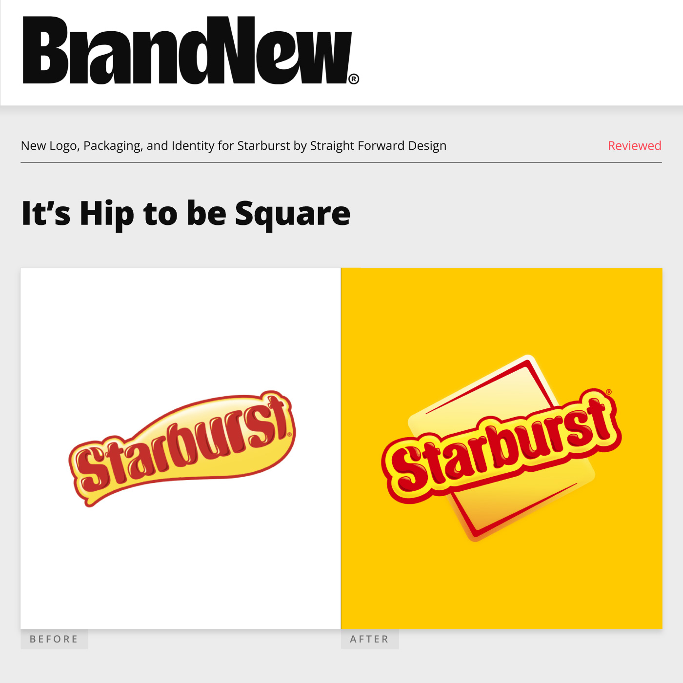
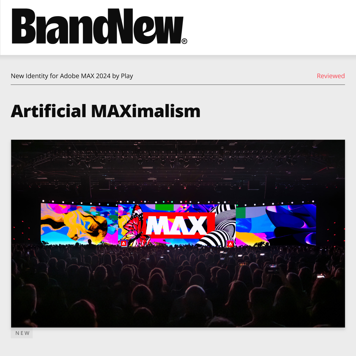
It’s Hip to be Square
New Logo, Packaging, and Identity for Starburst by Straight Forward Design
Reviewed Sep. 30, 2025

Starburst is a brand of fruit taffy candies known for their distinctive square form and folded paper wrappers. Created by Mars, they were originally launched in 1959 in the United Kingdom under the name Opal Fruits. They were brought to the Unites States in 1967 with the name M&M’s Fruit Chewies in an effort to borrow some equity from M&M’s candy-coated chocolates. This worked a bit too well and sales slumped, presumably because the M&M’s brand had been going strong for over two decades and had established a strong association with chocolate in the minds of multiple generations of candy consumers. This inadvertently created the unappetizing visual of fruity, chewy chocolates. The name was updated the next year to Starburst. While the astral origins of the name are unknown, the timing makes it likely that it was an effort to capitalize on the same 1960s space race frenzy which gave us consumer foodstuffs such as freeze-dried ice cream, Tang, and the Pillsbury Space Food Stick.

The candy comes in four core flavors: cherry, lemon, strawberry, and orange. But like many candy brands that have made it to the year 2025, countless alternate forms and flavors exist. The brand has been loaned out to a handful of other companies for collaborations, including Lip Smackers lip gloss (2004), Yoplait yogurt (2019), C4 energy drinks (2022), and Sparkling Ice flavored waters (2024). In-house innovations have resulted in everything from jelly beans to gelatin, ice creams to ice pops, candy corn to candy canes. There are tropical Starbursts. Sour Starbursts. Spicy Starbursts. Lemonade, blue-raspberry, and berries and cream Starbursts.

What seems ostensibly like a single candy in an expansive constellation of the Mars portfolio of snacks is actually a whole galaxy unto itself, and every now and then a soft reboot is helpful to keep things fresh. The new logo, packaging, and visual system was launched in September 2025 and designed by London, UK-based Straight Forward Design.


Read the full article at Brand New
Adobe MAX 2024 by Play Affinity done In-house Bombardier by Lippincott Brompton House by UnitedUs Canva Create 2025 done In-house Daylight Computer Company by The Office of Ordinary Things Docusign done In-house Elica by Landor Elodie by Koto F.C. København by Kontrapunkt Fhirst by Mother Design FIDE 2021 World Chess Championship by Morillas Flow Power by Self–titled Gobi Cashmere by Mucho Grand Palais by Base Design GSK by Wolff Olins GUT by &Walsh Intrinsic by Pentagram 57th Karlovy Vary International Film Festival by Studio Najbrt Kentucky Bourbon Trail by Lewis Kimberly-Clark by Someoddpilot La-Z-Boy by Colle McVoy Lex by &Walsh Lobe by FAY Marin Living Foods by The Working Assembly Marshmallow by Ragged Edge Mundo Chachapoyas by Studioa Norwegian by Try Design NVRD by Airsolid Outschool by Geist Saintly by Universal Favourite SATREV by Symbol Studio Seattle Reign FC by Redscout Shop by Porto Rocha SK Rapid Vienna by Beyer Görges Starburst by Straight Forward Design Sigma by Stockholm Design Lab Snooz by How&How Sommerro by Bielke&Yang Son of a Tailor by Ragged Edge TBWA by Plau, Fuze, and In-house The Beams by Only Viva by ILLO Studio
Uncanny Vhalley
New Logo, Packaging, and Identity for Fhirst by Mother Design
Reviewed Sep. 4, 2025

Headquartered in Los Angeles, CA, and launched in the United Kingdom in 2023 by Belgian beverage entrepreneurs Catherine and Steven Van Middelem, Fhirst is a brand of gut-health sodas which currently comes in four flavors – Pineapple Yuzuphoria, Dr. Cherry Happy Place, Good Time Lemon Lime, and Orange Cola Joyride. The drinks make a ton of health claims that I do not feel in any way qualified to parse, but if Coca-Cola doesn’t have enough probiotics, prebiotics, ginseng, magnesium, or pink sea salt for your taste, Fhirst may be just what the doctor nutritionist ordered. Their core differentiating factor seems to be a micro-encapsulation technology to prevent living cultures from degrading over time, allowing them to advertise a much longer shelf life than other probiotic drinks like kefirs and kombuchas. The new brand identity was designed by Brooklyn, NY-based Mother Design.

Read the full article at Brand New
Adobe MAX 2024 by Play Affinity done In-house Bombardier by Lippincott Brompton House by UnitedUs Canva Create 2025 done In-house Daylight Computer Company by The Office of Ordinary Things Docusign done In-house Elica by Landor Elodie by Koto F.C. København by Kontrapunkt Fhirst by Mother Design FIDE 2021 World Chess Championship by Morillas Flow Power by Self–titled Gobi Cashmere by Mucho GSK by Wolff Olins GUT by &Walsh Intrinsic by Pentagram 57th Karlovy Vary International Film Festival by Studio Najbrt Kentucky Bourbon Trail by Lewis Kimberly-Clark by Someoddpilot La-Z-Boy by Colle McVoy Lex by &Walsh Lobe by FAY Marin Living Foods by The Working Assembly Marshmallow by Ragged Edge Mundo Chachapoyas by Studioa Norwegian by Try Design NVRD by Airsolid Outschool by Geist Saintly by Universal Favourite SATREV by Symbol Studio Seattle Reign FC by Redscout Shop by Porto Rocha Starburst by Straight Forward Design Sigma by Stockholm Design Lab Sommerro by Bielke&Yang Son of a Tailor by Ragged Edge TBWA by Plau, Fuze, and In-house The Beams by Only Viva by ILLO Studio
Lean Into It
New Logo and Identity for La-Z-Boy by Colle McVoy
Reviewed Jul. 31, 2025

Established in 1927 in Monroe, MI, La-Z-Boy is a home-furnishings company which got its start as the doll and novelty furniture project of two cousins, Edward Knabusch and Edwin Shoemaker. One of their early successes was a phone bench with built-in storage for a phone receiver and phone book in an era when phones were still fairly new. But in 1929 they invented and patented a wood-slat folding porch chair with the ability to recline. One customer suggested upholstering their invention to turn it into a year-round piece, and another named the invention during an open call contest. Thus was born the La-Z-Boy reclining chair.

It would take another 12 years for the success of the chair to eclipse the rest of the business and in 1941 the company would be renamed from Floral City Furniture to the La-Z-Boy Chair Company. This one item would prove to be the driving force behind the business. To keep up with demand, La-Z-Boy branched out from manufacture into retail, making, marketing, and selling their own product in a chain of their own showrooms. Built-in ottomans, vibrating features, and rocking-chair variants were introduced throughout the 1950s and ’60s, and it would be 1983 before they started to experiment with stationary furniture again.

Today the company manufactures all manner of home furnishings alongside their iconic recliners: beds and benches, lamps and mirrors, from its 500 retail locations spread across 12 countries. The most recent brand refresh was led by Minneapolis, MN-based Colle McVoy.


Read the full article at Brand New
Adobe MAX 2024 by Play Affinity done In-house Bombardier by Lippincott Brompton House by UnitedUs Canva Create 2025 done In-house Daylight Computer Company by The Office of Ordinary Things Docusign done In-house Elica by Landor Elodie by Koto F.C. København by Kontrapunkt Fhirst by Mother Design FIDE 2021 World Chess Championship by Morillas Flow Power by Self–titled Gobi Cashmere by Mucho Grand Palais by Base Design GSK by Wolff Olins GUT by &Walsh Intrinsic by Pentagram 57th Karlovy Vary International Film Festival by Studio Najbrt Kentucky Bourbon Trail by Lewis Kimberly-Clark by Someoddpilot La-Z-Boy by Colle McVoy Lex by &Walsh Lobe by FAY Marin Living Foods by The Working Assembly Marshmallow by Ragged Edge Mundo Chachapoyas by Studioa Norwegian by Try Design NVRD by Airsolid Outschool by Geist Saintly by Universal Favourite SATREV by Symbol Studio Seattle Reign FC by Redscout Shop by Porto Rocha SK Rapid Vienna by Beyer Görges Starburst by Straight Forward Design Sigma by Stockholm Design Lab Snooz by How&How Sommerro by Bielke&Yang Son of a Tailor by Ragged Edge TBWA by Plau, Fuze, and In-house The Beams by Only Viva by ILLO Studio
Long May She Reign
New Identity for Seattle Reign FC by Redscout
Reviewed Jul. 3, 2025

Established in 2012 in Seattle, WA, Seattle Reign FC is one of the eight founding member clubs of the National Women’s Soccer League. Although they’ve yet to win an NWSL Championship, the team has made it to the final game three times since their founding, ceding the crown to FC Kansas City in both 2014 and 2015 and Gotham FC in 2023.

Reign has had a tumultuous ownership history, and with each change in hands came a change in brands. A mere four years after helping to kickstart the league, in 2019 the team switched ownership, stadiums, and cities with a move to Tacoma, Washington. This led them to drop the “Seattle” from their name. In 2020 the team was purchased by the French football club holding company OL Groupe, which caused the Reign FC change to OL Reign. This also marked the most drastic change to the logo – while OL Group was at the time parent to both a men’s and women’s team – Olympique Lyonnais and Olympique Lyonnais Féminin, respectively – the new Reign crest seemingly took their design cues and colors from the men’s team, replacing their queen with a full-maned lion. News of this rebrand didn’t make it onto Brand New, but the return of the queen in 2023 did. OL Groupe announced that their ownership of the team would end on December 31st, 2023. On January 8, 2024, the original logo was back with a fresh coat of paint.

Following a return to their original crest and name, New York, NY-based Redscout was brought on board to develop a new identity system which is currently being rolled out as the 2025 season progresses.


Read the full article at Brand New
Adobe MAX 2024 by Play Affinity done In-house Bombardier by Lippincott Brompton House by UnitedUs Canva Create 2025 done In-house Daylight Computer Company by The Office of Ordinary Things Docusign done In-house Elica by Landor Elodie by Koto F.C. København by Kontrapunkt Fhirst by Mother Design FIDE 2021 World Chess Championship by Morillas Flow Power by Self–titled Gobi Cashmere by Mucho Grand Palais by Base Design GSK by Wolff Olins GUT by &Walsh Intrinsic by Pentagram 57th Karlovy Vary International Film Festival by Studio Najbrt Kentucky Bourbon Trail by Lewis Kimberly-Clark by Someoddpilot La-Z-Boy by Colle McVoy Lex by &Walsh Lobe by FAY Marin Living Foods by The Working Assembly Marshmallow by Ragged Edge Mundo Chachapoyas by Studioa Norwegian by Try Design NVRD by Airsolid Outschool by Geist Saintly by Universal Favourite SATREV by Symbol Studio Seattle Reign FC by Redscout Shop by Porto Rocha SK Rapid Vienna by Beyer Görges Starburst by Straight Forward Design Sigma by Stockholm Design Lab Snooz by How&How Sommerro by Bielke&Yang Son of a Tailor by Ragged Edge TBWA by Plau, Fuze, and In-house The Beams by Only Viva by ILLO Studio
That Sigma Rizz
New Logo and Identity for Sigma by Stockholm Design Lab
Reviewed Jun. 16, 2025

Founded in 1961, Sigma is a family-owned camera equipment manufacturer in Kawasaki, Japan. Despite operating out of a single factory in Aizu, they’ve nonetheless established themselves as the world’s largest independent manufacturer of camera lenses and are a founding member of the L-Mount Alliance lens mounting standard alongside Leica and Panasonic.

Within the professional photography realm they’ve developed a reputation for equal parts craftsmanship and eccentricity, both qualities which are exemplified by their latest camera, the Sigma BF. The BF is a $2,000 interchangeable lens mirrorless digital body with a 35mm full-frame sensor which embraces a philosophy of radical simplicity that eliminates much of what you’d expect to find on a camera in its category. Its lack of features such as robust controls, ergonomics, a flash bracket, or a viewfinder leaves it nebulously hanging somewhere between segments. In the first few months on the market, the BF has received a litany of mixed reviews with titles like Just How Impractical Is Sigma’s Bizarre New Camera? and The Sigma BF Stands for ‘Beautiful Foolishness’. It would be easy to write these decisions off as cost-cutting measures if not for the fact that the camera is housed in a bespoke solid-aluminum body so complex to manufacturer that the company can only make nine of them per day, which contributed to the camera selling out in its home country a month ahead of launch.

Coinciding with the launch of this camera back in February 2025 was a rebranding effort led by Stockholm, Sweden-based Stockholm Design Lab.


Read the full article at Brand New
Adobe MAX 2024 by Play Affinity done In-house Bombardier by Lippincott Brompton House by UnitedUs Canva Create 2025 done In-house Daylight Computer Company by The Office of Ordinary Things Docusign done In-house Elica by Landor Elodie by Koto F.C. København by Kontrapunkt Fhirst by Mother Design FIDE 2021 World Chess Championship by Morillas Flow Power by Self–titled Gobi Cashmere by Mucho Grand Palais by Base Design GSK by Wolff Olins GUT by &Walsh Intrinsic by Pentagram 57th Karlovy Vary International Film Festival by Studio Najbrt Kentucky Bourbon Trail by Lewis Kimberly-Clark by Someoddpilot La-Z-Boy by Colle McVoy Lex by &Walsh Lobe by FAY Marin Living Foods by The Working Assembly Marshmallow by Ragged Edge Mundo Chachapoyas by Studioa Norwegian by Try Design NVRD by Airsolid Outschool by Geist Saintly by Universal Favourite SATREV by Symbol Studio Seattle Reign FC by Redscout Shop by Porto Rocha SK Rapid Vienna by Beyer Görges Starburst by Straight Forward Design Sigma by Stockholm Design Lab Snooz by How&How Sommerro by Bielke&Yang Son of a Tailor by Ragged Edge TBWA by Plau, Fuze, and In-house The Beams by Only Viva by ILLO Studio
A Unique Celling Point
New identity for Canva Create 2025 done In-house
Reviewed May. 20, 2025

Beginning in 2022, Canva Create is an annual conference showcasing the latest news and features for the freemium web-based design software platform Canva. The Sydney, Australia-based company has really hit its stride lately. In the scant two years since we last checked in with them, they’ve expanded their active user base from 125 million to 220 million, launched Canva Enterprise paid plans for large organizations, and acquired the makers of the Affinity design suite. This year’s conference, titled “Uncharted”, was held before a crowd of 4,000 in-person attendees at Inglewood, California’s SoFi Stadium with 2 million people tuning in for the free virtual event. The identity for the conference was designed by Canva’s in-house team, Canva Creative.

Read the full article at Brand New
Adobe MAX 2024 by Play Affinity done In-house Bombardier by Lippincott Brompton House by UnitedUs Canva Create 2025 done In-house Daylight Computer Company by The Office of Ordinary Things Docusign done In-house Elica by Landor Elodie by Koto F.C. København by Kontrapunkt Fhirst by Mother Design FIDE 2021 World Chess Championship by Morillas Flow Power by Self–titled Gobi Cashmere by Mucho Grand Palais by Base Design GSK by Wolff Olins GUT by &Walsh Intrinsic by Pentagram 57th Karlovy Vary International Film Festival by Studio Najbrt Kentucky Bourbon Trail by Lewis Kimberly-Clark by Someoddpilot La-Z-Boy by Colle McVoy Lex by &Walsh Lobe by FAY Marin Living Foods by The Working Assembly Marshmallow by Ragged Edge Mundo Chachapoyas by Studioa Norwegian by Try Design NVRD by Airsolid Outschool by Geist Saintly by Universal Favourite SATREV by Symbol Studio Seattle Reign FC by Redscout Shop by Porto Rocha SK Rapid Vienna by Beyer Görges Starburst by Straight Forward Design Sigma by Stockholm Design Lab Snooz by How&How Sommerro by Bielke&Yang Son of a Tailor by Ragged Edge TBWA by Plau, Fuze, and In-house The Beams by Only Viva by ILLO Studio
Plane-ly Stated
New Logo and Identity for Norwegian by Try Design
Reviewed Apr. 17, 2025

Founded in 1993, Norwegian Air Shuttle ASA – better known as Norwegian – is a budget airline headquartered in Fornebu, Norway. Beginning life as a regional budget affair catering to western Norway with three planes, Norwegian grew steadily over their first few decades. At their peak in 2018, they were the largest airline in Scandinavia with 165 planes and routes spanning over 50 international destinations, including intercontinental flights to Asia and North America.

But then the COVID pandemic did what it did to the aviation industry. In 2020 they laid off over 7,000 workers, sold off many of their planes, and ended their intercontinental operations to focus on a reduced European network. Despite keeping to the confines of the European continent, the airline is currently on the upswing. Following a purchase of 50 Boeing 737 MAX 8 planes in 2022 and the regional Norwegian carrier Widerøe in 2024, Norwegian is creeping back up the charts, and today they occupy the rank of 10th largest European airline by passenger volume.

The new brand and identity was developed by TRY Design, which itself is based out of Oslo, Norway.


Read the full article at Brand New
Adobe MAX 2024 by Play Affinity done In-house Bombardier by Lippincott Brompton House by UnitedUs Canva Create 2025 done In-house Daylight Computer Company by The Office of Ordinary Things Docusign done In-house Elica by Landor Elodie by Koto F.C. København by Kontrapunkt Fhirst by Mother Design FIDE 2021 World Chess Championship by Morillas Flow Power by Self–titled Gobi Cashmere by Mucho Grand Palais by Base Design GSK by Wolff Olins GUT by &Walsh Intrinsic by Pentagram 57th Karlovy Vary International Film Festival by Studio Najbrt Kentucky Bourbon Trail by Lewis Kimberly-Clark by Someoddpilot La-Z-Boy by Colle McVoy Lex by &Walsh Lobe by FAY Marin Living Foods by The Working Assembly Marshmallow by Ragged Edge Mundo Chachapoyas by Studioa Norwegian by Try Design NVRD by Airsolid Outschool by Geist Saintly by Universal Favourite SATREV by Symbol Studio Seattle Reign FC by Redscout Shop by Porto Rocha SK Rapid Vienna by Beyer Görges Starburst by Straight Forward Design Sigma by Stockholm Design Lab Snooz by How&How Sommerro by Bielke&Yang Son of a Tailor by Ragged Edge TBWA by Plau, Fuze, and In-house The Beams by Only Viva by ILLO Studio
Turn the Other Cheek
New Name, Logo, and Identity for Saintly by Universal Favourite
Reviewed Mar. 31, 2025

Launched in 2019 as Fohm and renamed in 2024, Saintly is a personal hygiene company based in New York, NY. Their core product is an automatic, touch-free dispenser which can be mounted on bathroom walls or set atop counters to apply foaming cleanser to toilet paper, serving the audience who want a more ecological alternative to flushable wipes but who aren’t ready to pull the trigger on a bidet. The new name, logo, and identity of the company was developed by Sydney, Australia-based Universal Favourite.

Read the full article at Brand New
Adobe MAX 2024 by Play Affinity done In-house Bombardier by Lippincott Brompton House by UnitedUs Canva Create 2025 done In-house Daylight Computer Company by The Office of Ordinary Things Docusign done In-house Elica by Landor Elodie by Koto F.C. København by Kontrapunkt Fhirst by Mother Design FIDE 2021 World Chess Championship by Morillas Flow Power by Self–titled Gobi Cashmere by Mucho Grand Palais by Base Design GSK by Wolff Olins GUT by &Walsh Intrinsic by Pentagram 57th Karlovy Vary International Film Festival by Studio Najbrt Kentucky Bourbon Trail by Lewis Kimberly-Clark by Someoddpilot La-Z-Boy by Colle McVoy Lex by &Walsh Lobe by FAY Marin Living Foods by The Working Assembly Marshmallow by Ragged Edge Mundo Chachapoyas by Studioa Norwegian by Try Design NVRD by Airsolid Outschool by Geist Saintly by Universal Favourite SATREV by Symbol Studio Seattle Reign FC by Redscout Shop by Porto Rocha SK Rapid Vienna by Beyer Görges Starburst by Straight Forward Design Sigma by Stockholm Design Lab Snooz by How&How Sommerro by Bielke&Yang Son of a Tailor by Ragged Edge TBWA by Plau, Fuze, and In-house The Beams by Only Viva by ILLO Studio
Artificial MAXimalism
New Identity for Adobe MAX 2024 by Play
Reviewed Mar. 18, 2025

Inaugurated in 2003, the first version of what would become Adobe MAX was the Macromedia MAX Conference in Salt Lake City, UT. Prior to 2003, Macromedia had been hosting two separate annual conferences to cater to their general software users (UCON, since 1990) and web developers (DevCon, since 1999). MAX was their effort to combine these audiences with one big event, featuring support labs, networking, a judged competition, and a showcase of the latest Macromedia products.

Adobe acquired Macromedia in 2005. The Macromedia name has long since fizzled out, but they’ve kept MAX going in continuity as an annual conference, switching from in-person to online-only during the COVID-19 pandemic in 2020 and 2021, and switching to a hybrid in-person/digital affair ever since. While promoting the latest design software to users and developers has remained the core conceit, the conference has expanded over the years to include a speaker series, vendor halls, parties, and educational courses which have built up MAX into a landmark event in the digital art and design industry. Despite color licensing spats, botched acquisitions, and subscription pricing scandals in recent years, Adobe products remain the industry standard and market leader in creativity software. And the annual Adobe MAX conference has played a vital role in keeping Adobe front-of-mind for generations of designers. MAX regularly attracts over 10,000 in-person attendees and 21 million virtual event views.

This past year, Adobe MAX took place in October at the Miami Beach Convention Center in Miami Beach, FL. The identity, event graphics, and campaign were designed by San Francisco, CA-based Play.


Read the full article at Brand New
Adobe MAX 2024 by Play Affinity done In-house Bombardier by Lippincott Brompton House by UnitedUs Canva Create 2025 done In-house Daylight Computer Company by The Office of Ordinary Things Docusign done In-house Elica by Landor Elodie by Koto F.C. København by Kontrapunkt Fhirst by Mother Design FIDE 2021 World Chess Championship by Morillas Flow Power by Self–titled Gobi Cashmere by Mucho Grand Palais by Base Design GSK by Wolff Olins GUT by &Walsh Intrinsic by Pentagram 57th Karlovy Vary International Film Festival by Studio Najbrt Kentucky Bourbon Trail by Lewis Kimberly-Clark by Someoddpilot La-Z-Boy by Colle McVoy Lex by &Walsh Lobe by FAY Marin Living Foods by The Working Assembly Marshmallow by Ragged Edge Mundo Chachapoyas by Studioa Norwegian by Try Design NVRD by Airsolid Outschool by Geist Saintly by Universal Favourite SATREV by Symbol Studio Seattle Reign FC by Redscout Shop by Porto Rocha SK Rapid Vienna by Beyer Görges Starburst by Straight Forward Design Sigma by Stockholm Design Lab Snooz by How&How Sommerro by Bielke&Yang Son of a Tailor by Ragged Edge TBWA by Plau, Fuze, and In-house The Beams by Only Viva by ILLO Studio
Putting On Airs
New Logo and Identity for Elica by Landor
Reviewed Mar. 4, 2025

Founded in 1970, Elica is a designer and manufacturer of home appliances headquartered in Fabriano, Italy, best known for their line of range hoods, the mechanical fans which vent smoke and steam out of the kitchen while cooking. The company carved out their niche of the already niche fume extractor industry by designing functional machines with intriguing sculptural aesthetics. Their modern selection is chic and respectable – within the limited aesthetic range of the modern stainless steel kitchen, these designs somehow manage to evoke very different looks and feels through careful use of subtle angles and modest curves. But Elica has persisted through every era of trendy home decor since the ’70s, which means that their back catalog has some really fun and funky stuff buried in it. If you look through the discontinued stock, you’ll find kitchen hoods seemingly inspired by anything from tree branches to cheese graters to gumdrops to disco balls. Their latest flagship, the NikolaTesla Flux, is just as creative (if not quite as colorful), a surface-mounted downdraft ventilator which sucks the fumes down into the cooktop itself and negates the need for an overhead hood. At Milan Design Week in April 2024, Elica introduced a new identity designed by the Milan, Italy, office of Landor.

Read the full article at Brand New
Adobe MAX 2024 by Play Affinity done In-house Bombardier by Lippincott Brompton House by UnitedUs Canva Create 2025 done In-house Daylight Computer Company by The Office of Ordinary Things Docusign done In-house Elica by Landor Elodie by Koto F.C. København by Kontrapunkt Fhirst by Mother Design FIDE 2021 World Chess Championship by Morillas Flow Power by Self–titled Gobi Cashmere by Mucho Grand Palais by Base Design GSK by Wolff Olins GUT by &Walsh Intrinsic by Pentagram 57th Karlovy Vary International Film Festival by Studio Najbrt Kentucky Bourbon Trail by Lewis Kimberly-Clark by Someoddpilot La-Z-Boy by Colle McVoy Lex by &Walsh Lobe by FAY Marin Living Foods by The Working Assembly Marshmallow by Ragged Edge Mundo Chachapoyas by Studioa Norwegian by Try Design NVRD by Airsolid Outschool by Geist Saintly by Universal Favourite SATREV by Symbol Studio Seattle Reign FC by Redscout Shop by Porto Rocha SK Rapid Vienna by Beyer Görges Starburst by Straight Forward Design Sigma by Stockholm Design Lab Snooz by How&How Sommerro by Bielke&Yang Son of a Tailor by Ragged Edge TBWA by Plau, Fuze, and In-house The Beams by Only Viva by ILLO Studio
Get the Energy Flowing
New Identity for Flow Power by Self–titled
Reviewed Jan. 30, 2025

Founded in 1994 as Utilacor, re-branded to Progressive Green in 2009, and then re-re-branded in 2017 to their current name, Flow Power is an Australian energy retailer focused on providing renewable energy via their own wind and solar farms, as well as partnering with the GreenPower governmental program to offset any non-renewable energy. Over the past 30 years they’ve served exclusively commercial and industrial clients — large businesses like Snack Brands Australia and large municipalities like the cities of Sydney and Adeliade. As of 2024 the company began to expand into providing residential electricity plans. To introduce this new service to the public, Flow partnered with Melbourne, Australia-based Self–titled to create a new residential-retail electric identity.

Read the full article at Brand New
Adobe MAX 2024 by Play Affinity done In-house Bombardier by Lippincott Brompton House by UnitedUs Canva Create 2025 done In-house Daylight Computer Company by The Office of Ordinary Things Docusign done In-house Elica by Landor Elodie by Koto F.C. København by Kontrapunkt Fhirst by Mother Design FIDE 2021 World Chess Championship by Morillas Flow Power by Self–titled Gobi Cashmere by Mucho Grand Palais by Base Design GSK by Wolff Olins GUT by &Walsh Intrinsic by Pentagram 57th Karlovy Vary International Film Festival by Studio Najbrt Kentucky Bourbon Trail by Lewis Kimberly-Clark by Someoddpilot La-Z-Boy by Colle McVoy Lex by &Walsh Lobe by FAY Marin Living Foods by The Working Assembly Marshmallow by Ragged Edge Mundo Chachapoyas by Studioa Norwegian by Try Design NVRD by Airsolid Outschool by Geist Saintly by Universal Favourite SATREV by Symbol Studio Seattle Reign FC by Redscout Shop by Porto Rocha SK Rapid Vienna by Beyer Görges Starburst by Straight Forward Design Sigma by Stockholm Design Lab Snooz by How&How Sommerro by Bielke&Yang Son of a Tailor by Ragged Edge TBWA by Plau, Fuze, and In-house The Beams by Only Viva by ILLO Studio
Gobi or Go Home
New Logo and Identity for Gobi Cashmere by Mucho
Reviewed Nov. 12, 2024

Gobi Cashmere is a producer of luxury cashmere goods headquartered in Ulaanbaatar, Mongolia. It was founded as a state-owned business in 1981 as a project of UNIDO, the United Nations Industrial Development Organization with the goal of kickstarting economic and industrial development in the country and was fully privatized in 2007. With one third of the Mongolian population being nomadic and relying on livestock agriculture for their income, the goat-hair textile has become the third largest export commodity in the nation behind gold and copper. Gobi is Mongolia’s largest single producer of cashmere, processing around 1,200 tons of textiles annually. Despite expanding its export business to East Asian, European, and American markets, Gobi has maintained all of its cashmere production through a single Ulaanbaatar factory. In October 2024, the company unveiled a new logo and visual identity designed by the San Francisco, CA, office of Mucho.

Read the full article at Brand New
Adobe MAX 2024 by Play Affinity done In-house Bombardier by Lippincott Brompton House by UnitedUs Canva Create 2025 done In-house Daylight Computer Company by The Office of Ordinary Things Docusign done In-house Elica by Landor Elodie by Koto F.C. København by Kontrapunkt Fhirst by Mother Design FIDE 2021 World Chess Championship by Morillas Flow Power by Self–titled Gobi Cashmere by Mucho Grand Palais by Base Design GSK by Wolff Olins GUT by &Walsh Intrinsic by Pentagram 57th Karlovy Vary International Film Festival by Studio Najbrt Kentucky Bourbon Trail by Lewis Kimberly-Clark by Someoddpilot La-Z-Boy by Colle McVoy Lex by &Walsh Lobe by FAY Marin Living Foods by The Working Assembly Marshmallow by Ragged Edge Mundo Chachapoyas by Studioa Norwegian by Try Design NVRD by Airsolid Outschool by Geist Saintly by Universal Favourite SATREV by Symbol Studio Seattle Reign FC by Redscout Shop by Porto Rocha SK Rapid Vienna by Beyer Görges Starburst by Straight Forward Design Sigma by Stockholm Design Lab Snooz by How&How Sommerro by Bielke&Yang Son of a Tailor by Ragged Edge TBWA by Plau, Fuze, and In-house The Beams by Only Viva by ILLO Studio
FCK Yeah
New Logo and Identity for F.C. København by Kontrapunkt
Reviewed Oct. 29, 2024

F.C. København (Football Club Copenhagen) or FCK for short is, as the name suggests, a professional football club based in Copenhagen, Denmark. While the club itself was founded in 1992, it was formed as a parent organization for some of the oldest sports clubs in continental Europe when Boldklubben 1903 (The Ball Club 1903, founded 1903) and Kjøbenhavns Boldklub (Copenhagen Football Club, founded 1876) joined forces. The club boasts a record 15 Danish Superliga championships and 9 Danish Cup wins, after the 2022–23 season saw them win both titles. A new visual identity for the club was unveiled in July 2024 and designed by the Copenhagen, Denmark-based office of Kontrapunkt.

Read the full article at Brand New
Adobe MAX 2024 by Play Affinity done In-house Bombardier by Lippincott Brompton House by UnitedUs Canva Create 2025 done In-house Daylight Computer Company by The Office of Ordinary Things Docusign done In-house Elica by Landor Elodie by Koto F.C. København by Kontrapunkt Fhirst by Mother Design FIDE 2021 World Chess Championship by Morillas Flow Power by Self–titled Gobi Cashmere by Mucho Grand Palais by Base Design GSK by Wolff Olins GUT by &Walsh Intrinsic by Pentagram 57th Karlovy Vary International Film Festival by Studio Najbrt Kentucky Bourbon Trail by Lewis Kimberly-Clark by Someoddpilot La-Z-Boy by Colle McVoy Lex by &Walsh Lobe by FAY Marin Living Foods by The Working Assembly Marshmallow by Ragged Edge Mundo Chachapoyas by Studioa Norwegian by Try Design NVRD by Airsolid Outschool by Geist Saintly by Universal Favourite SATREV by Symbol Studio Seattle Reign FC by Redscout Shop by Porto Rocha SK Rapid Vienna by Beyer Görges Starburst by Straight Forward Design Sigma by Stockholm Design Lab Snooz by How&How Sommerro by Bielke&Yang Son of a Tailor by Ragged Edge TBWA by Plau, Fuze, and In-house The Beams by Only Viva by ILLO Studio
A Small Batch of Big Changes
New Logo and Identity for Kentucky Bourbon Trail by Lewis
Reviewed Oct. 8, 2024

Launched in 1999, the Kentucky Bourbon Trail is a tourism program which winds throughout the state, connecting a wide range of distillery tours and tastings into a single index. Originally a collaboration between Kentucky’s seven largest distilleries, over the past twenty-five years the trail has been steadily growing, adding national brands and smaller craft businesses into the mix. Today there are 46 stops in total, spanning over 300 miles of Kentucky and attracting a reported 2.5 million visitors last year. The route has grown so sprawling, in fact, that a field guide to track all the stops was launched in 2021, only to be retired three years later due to the increasing difficulty of visiting each distillery. Which is a tremendous loss to me, personally, as a lifelong fan of road trips and passport stamp promotions.

To celebrate the quarter century anniversary, the Kentucky Distillers’ Association commissioned Brentwood, Tennessee-based studio Lewis Communications to craft a new brand identity and website.


Read the full article at Brand New
Adobe MAX 2024 by Play Affinity done In-house Bombardier by Lippincott Brompton House by UnitedUs Canva Create 2025 done In-house Daylight Computer Company by The Office of Ordinary Things Docusign done In-house Elica by Landor Elodie by Koto F.C. København by Kontrapunkt Fhirst by Mother Design FIDE 2021 World Chess Championship by Morillas Flow Power by Self–titled Gobi Cashmere by Mucho Grand Palais by Base Design GSK by Wolff Olins GUT by &Walsh Intrinsic by Pentagram 57th Karlovy Vary International Film Festival by Studio Najbrt Kentucky Bourbon Trail by Lewis Kimberly-Clark by Someoddpilot La-Z-Boy by Colle McVoy Lex by &Walsh Lobe by FAY Marin Living Foods by The Working Assembly Marshmallow by Ragged Edge Mundo Chachapoyas by Studioa Norwegian by Try Design NVRD by Airsolid Outschool by Geist Saintly by Universal Favourite SATREV by Symbol Studio Seattle Reign FC by Redscout Shop by Porto Rocha SK Rapid Vienna by Beyer Görges Starburst by Straight Forward Design Sigma by Stockholm Design Lab Snooz by How&How Sommerro by Bielke&Yang Son of a Tailor by Ragged Edge TBWA by Plau, Fuze, and In-house The Beams by Only Viva by ILLO Studio
Simply Daylight-ful
New Logo and Identity for Daylight Computer Company by The Office of Ordinary Things
Reviewed Sep. 23, 2024

Launched in May 2024, Daylight Computer Company is an electronics manufacturer headquartered in San Francisco, CA. The company is focused on the pursuit of the third timeline, an ideological framework proposed by Daylight’s former Philosopher-in-Residence Peter N Limberg, which serves as a middle-ground between the conflicting futurist theories of accelerationism and decelerationism. While accelerationists seek to drastically intensify the progression of technology in order to destabilize existing systems to force societal change and decelerationists seek to halt or reverse technological progress in order to protect humanity from the corrupting forces of technology and capitalism, the “third timeline” imagines a world in which neither strategy comes to pass, and instead technologies are developed in symbiosis with human life.

To that end, Daylight has recently launched their first product, the DC-1. It is an Android tablet with a black-and-white reflective LCD display, giving it the look of an e-paper device (a la Kindle) but with a 60 Hz refresh rate and touch gesture sensitivity that make it perform more like a traditional tablet. Packaged with a pressure sensitive Wacom stylus and a padded case, the DC-1 aims to be an outdoors-first computer optimized for reading, writing, and drawing under direct sunlight. The identity for Daylight was designed by San Francisco-based studio The Office of Ordinary Things.


Read the full article at Brand New
Adobe MAX 2024 by Play Affinity done In-house Bombardier by Lippincott Brompton House by UnitedUs Canva Create 2025 done In-house Daylight Computer Company by The Office of Ordinary Things Docusign done In-house Elica by Landor Elodie by Koto F.C. København by Kontrapunkt Fhirst by Mother Design FIDE 2021 World Chess Championship by Morillas Flow Power by Self–titled Gobi Cashmere by Mucho Grand Palais by Base Design GSK by Wolff Olins GUT by &Walsh Intrinsic by Pentagram 57th Karlovy Vary International Film Festival by Studio Najbrt Kentucky Bourbon Trail by Lewis Kimberly-Clark by Someoddpilot La-Z-Boy by Colle McVoy Lex by &Walsh Lobe by FAY Marin Living Foods by The Working Assembly Marshmallow by Ragged Edge Mundo Chachapoyas by Studioa Norwegian by Try Design NVRD by Airsolid Outschool by Geist Saintly by Universal Favourite SATREV by Symbol Studio Seattle Reign FC by Redscout Shop by Porto Rocha SK Rapid Vienna by Beyer Görges Starburst by Straight Forward Design Sigma by Stockholm Design Lab Snooz by How&How Sommerro by Bielke&Yang Son of a Tailor by Ragged Edge TBWA by Plau, Fuze, and In-house The Beams by Only Viva by ILLO Studio
A Mundo of Difference
New Name, Logo, and Identity for Mundo Chachapoyas by Studioa
Reviewed Aug. 13, 2024

The Tourist Corridor of Utcubamba is a collection of cultural and ecological sites that run along the Utcubamba River Valley in the Amazonas Region of Peru. The region is associated with the pre-Incan Chachapoya people, also called “Warriors of the Clouds”, who lived there from 800 – 1740 C.E. and lend their name to the modern-day capital city of Chachapoyas. Ancient cities, cliff-side mausoleums, and vibrant living cities dot the countryside between natural hot springs, waterfalls, cloud forests, and wild orchids. In doing my background research on the Utcubamba Corridor, the pitch I keep coming across from travel guides and blogs is that it’s Machu Picchu without the crowds. The most direct point of comparison is the Kuelap Fortress, an ancient fortified citadel on the slopes of the Andes that draws in an estimated 200,000 tourists a year compared to Machu Picchu’s annual 1.5 million. Launched in September 2023 to promote tourism to the Utcubamba Corridor as Aventúrate Chachapoyas, the new name, logo, and identity Mundo Chachapoyas was unveiled in June 2024 by Lima, Peru-based Studioa.

Read the full article at Brand New
Adobe MAX 2024 by Play Affinity done In-house Bombardier by Lippincott Brompton House by UnitedUs Canva Create 2025 done In-house Daylight Computer Company by The Office of Ordinary Things Docusign done In-house Elica by Landor Elodie by Koto F.C. København by Kontrapunkt Fhirst by Mother Design FIDE 2021 World Chess Championship by Morillas Flow Power by Self–titled Gobi Cashmere by Mucho Grand Palais by Base Design GSK by Wolff Olins GUT by &Walsh Intrinsic by Pentagram 57th Karlovy Vary International Film Festival by Studio Najbrt Kentucky Bourbon Trail by Lewis Kimberly-Clark by Someoddpilot La-Z-Boy by Colle McVoy Lex by &Walsh Lobe by FAY Marin Living Foods by The Working Assembly Marshmallow by Ragged Edge Mundo Chachapoyas by Studioa Norwegian by Try Design NVRD by Airsolid Outschool by Geist Saintly by Universal Favourite SATREV by Symbol Studio Seattle Reign FC by Redscout Shop by Porto Rocha SK Rapid Vienna by Beyer Görges Starburst by Straight Forward Design Sigma by Stockholm Design Lab Snooz by How&How Sommerro by Bielke&Yang Son of a Tailor by Ragged Edge TBWA by Plau, Fuze, and In-house The Beams by Only Viva by ILLO Studio
Livin’ la Vida Sana
New Logo and Identity for Viva by ILLO Studio
Reviewed Jul. 2, 2024

Viva is an app focused on women’s health for the Latin American market. The app consists of audio courses which focus on coaching different aspects of mental, physical, and professional health. The company was founded in Uruguay in 2021 and launched the Spanish version of their app in May of 2024, with an English version currently in development and planned to launch later this year. The initial brand and identity was designed by Turin, Italy-based IILO Studio.

Read the full article at Brand New
Adobe MAX 2024 by Play Affinity done In-house Bombardier by Lippincott Brompton House by UnitedUs Canva Create 2025 done In-house Daylight Computer Company by The Office of Ordinary Things Docusign done In-house Elica by Landor Elodie by Koto F.C. København by Kontrapunkt Fhirst by Mother Design FIDE 2021 World Chess Championship by Morillas Flow Power by Self–titled Gobi Cashmere by Mucho Grand Palais by Base Design GSK by Wolff Olins GUT by &Walsh Intrinsic by Pentagram 57th Karlovy Vary International Film Festival by Studio Najbrt Kentucky Bourbon Trail by Lewis Kimberly-Clark by Someoddpilot La-Z-Boy by Colle McVoy Lex by &Walsh Lobe by FAY Marin Living Foods by The Working Assembly Marshmallow by Ragged Edge Mundo Chachapoyas by Studioa Norwegian by Try Design NVRD by Airsolid Outschool by Geist Saintly by Universal Favourite SATREV by Symbol Studio Seattle Reign FC by Redscout Shop by Porto Rocha SK Rapid Vienna by Beyer Görges Starburst by Straight Forward Design Sigma by Stockholm Design Lab Snooz by How&How Sommerro by Bielke&Yang Son of a Tailor by Ragged Edge TBWA by Plau, Fuze, and In-house The Beams by Only Viva by ILLO Studio
The Blank Page
New Logo and Identity for Kimberly-Clark by Someoddpilot
Reviewed May. 21, 2024

Kimberly-Clark began in 1872 as a paper mill operator in Neehah, Wisconsin. They spent the next century and a half alternating between building more paper mills and finding new uses for paper. Being a mill operator in 19th century America, the company had already achieved the sort of economic dominance where towns were being renamed after the founder. But the modern era of Kimberly-Clark really kicked off in 1914, during the first World War. The need for surgical bandages was quickly depleting the global supply of cotton. Kimberly-Clark’s engineers had recently discovered a technology for turning woodpulp into a thin textile which was five times as absorbent as cotton and could be produced for half the price, which they dubbed Cellucotton. It was much less durable than traditional fabrics, but the low cost of production and the recent prevalence of germ theory coincided to turn Cellucotton’s inherent weakness into its strongest selling point – disposability.

When the war ended, Kimberly-Clark wasted no time in finding other hygiene products which could be made from their new miracle material – handkerchiefs were replaced by Kleenex, sanitary belts and flannels were replaced by Kotex, and eventually Kimberly-Clark would find itself engaged in a decades-long product innovation cold war with Procter & Gamble over the design of disposable diapers.

Today, the Kimberly-Clark headquarters can be found in Irving, Texas. The company sold off the last of its paper mills in 2013, but they maintain a workforce of over 40,000 employees, a standing on the Fortune 500, a 78% market share of the global paper products industry, and a portfolio of highly recognizable sub-brands like Kleenex, Kotex, Scott, Cottonelle, and Huggies. A refreshed version of the brand designed by Chicago, Illinois-based Someoddpilot was unveiled in April 2024.


Read the full article at Brand New
Adobe MAX 2024 by Play Affinity done In-house Bombardier by Lippincott Brompton House by UnitedUs Canva Create 2025 done In-house Daylight Computer Company by The Office of Ordinary Things Docusign done In-house Elica by Landor Elodie by Koto F.C. København by Kontrapunkt Fhirst by Mother Design FIDE 2021 World Chess Championship by Morillas Flow Power by Self–titled Gobi Cashmere by Mucho Grand Palais by Base Design GSK by Wolff Olins GUT by &Walsh Intrinsic by Pentagram 57th Karlovy Vary International Film Festival by Studio Najbrt Kentucky Bourbon Trail by Lewis Kimberly-Clark by Someoddpilot La-Z-Boy by Colle McVoy Lex by &Walsh Lobe by FAY Marin Living Foods by The Working Assembly Marshmallow by Ragged Edge Mundo Chachapoyas by Studioa Norwegian by Try Design NVRD by Airsolid Outschool by Geist Saintly by Universal Favourite SATREV by Symbol Studio Seattle Reign FC by Redscout Shop by Porto Rocha SK Rapid Vienna by Beyer Görges Starburst by Straight Forward Design Sigma by Stockholm Design Lab Snooz by How&How Sommerro by Bielke&Yang Son of a Tailor by Ragged Edge TBWA by Plau, Fuze, and In-house The Beams by Only Viva by ILLO Studio
Cool Your Jets
New Logo and Identity for Bombardier by Lippincott
Reviewed Apr. 16, 2024

Founded in 1942, Bombardier is an aircraft manufacturer headquartered in Quebec, Canada. The business began as a means of marketing snowmobiles, but through a series of acquisitions and pivots became one of the world’s largest manufacturers of locomotives and aircraft by the 1990s. In 2015, the turbulent development of the CSeries line of airliners nearly bankrupted the company, leading to a consolidation which saw the sale of all of their operations outside of business jet manufacture and all of its offices outside North America. In addition to business jets, the company also manufactures aircraft platforms for government, defense, and humanitarian purposes. Last week, the company unveiled a new brand and identity designed by New York, NY-based Lippincott.

Read the full article at Brand New
Adobe MAX 2024 by Play Affinity done In-house Bombardier by Lippincott Brompton House by UnitedUs Canva Create 2025 done In-house Daylight Computer Company by The Office of Ordinary Things Docusign done In-house Elica by Landor Elodie by Koto F.C. København by Kontrapunkt Fhirst by Mother Design FIDE 2021 World Chess Championship by Morillas Flow Power by Self–titled Gobi Cashmere by Mucho Grand Palais by Base Design GSK by Wolff Olins GUT by &Walsh Intrinsic by Pentagram 57th Karlovy Vary International Film Festival by Studio Najbrt Kentucky Bourbon Trail by Lewis Kimberly-Clark by Someoddpilot La-Z-Boy by Colle McVoy Lex by &Walsh Lobe by FAY Marin Living Foods by The Working Assembly Marshmallow by Ragged Edge Mundo Chachapoyas by Studioa Norwegian by Try Design NVRD by Airsolid Outschool by Geist Saintly by Universal Favourite SATREV by Symbol Studio Seattle Reign FC by Redscout Shop by Porto Rocha SK Rapid Vienna by Beyer Görges Starburst by Straight Forward Design Sigma by Stockholm Design Lab Snooz by How&How Sommerro by Bielke&Yang Son of a Tailor by Ragged Edge TBWA by Plau, Fuze, and In-house The Beams by Only Viva by ILLO Studio
Sign of the Times
New Logo and Identity for Docusign done In-house
Reviewed Apr. 16, 2024

Founded in 2003, Docusign is an electronic signature company headquartered in San Francisco, CA, with international offices in 13 countries and about 7,000 employees. A little about my Docusign experience: I thought I was familiar with Docusign. Over the years I’ve interacted with the company countless times via “sign here” links sent to me by insurance agents and freelance gigs and car dealerships. But I – always an employee, never an employer – figured they were more of a standard digital format and less of a business that made money; I pictured them as a more formal version of the PDF signature tool. If your perspective matches mine, you might be as shocked as I was to learn that the digital signature market is a 7.4 billion-dollar-industry, over which Docusign reigns supreme with a 56.33% market share. Continuing to build their dominance in the signature space, Docusign recently announced their entry into the SaaS business with a new AI-powered Intelligent Agreement Management (IAM) platform, accompanied by a new identity designed in-house.

Read the full article at Brand New
Adobe MAX 2024 by Play Affinity done In-house Bombardier by Lippincott Brompton House by UnitedUs Canva Create 2025 done In-house Daylight Computer Company by The Office of Ordinary Things Docusign done In-house Elica by Landor Elodie by Koto F.C. København by Kontrapunkt Fhirst by Mother Design FIDE 2021 World Chess Championship by Morillas Flow Power by Self–titled Gobi Cashmere by Mucho Grand Palais by Base Design GSK by Wolff Olins GUT by &Walsh Intrinsic by Pentagram 57th Karlovy Vary International Film Festival by Studio Najbrt Kentucky Bourbon Trail by Lewis Kimberly-Clark by Someoddpilot La-Z-Boy by Colle McVoy Lex by &Walsh Lobe by FAY Marin Living Foods by The Working Assembly Marshmallow by Ragged Edge Mundo Chachapoyas by Studioa Norwegian by Try Design NVRD by Airsolid Outschool by Geist Saintly by Universal Favourite SATREV by Symbol Studio Seattle Reign FC by Redscout Shop by Porto Rocha SK Rapid Vienna by Beyer Görges Starburst by Straight Forward Design Sigma by Stockholm Design Lab Snooz by How&How Sommerro by Bielke&Yang Son of a Tailor by Ragged Edge TBWA by Plau, Fuze, and In-house The Beams by Only Viva by ILLO Studio
Don’t Let It Go To Waste
New Logo and Identity for NVRD by Airsolid
Reviewed Feb. 27, 2024

Founded in 1907, the NVRD (Koninklijke Nederlandse Vereniging Voor Afval- en Reinigingsdiensten) is the Royal Dutch Association for Waste and Cleaning Services. It organizes and represents all of the various service companies operating at the municipal level in The Netherlands and enacts public policy on waste, recycling, and sustainability initiatives in the country. As a member of the European Union’s Municipal Waste Europe program, the NVRD is working with other European nations to implement a circular economy in which all recoverable waste is converted to new raw material by the year 2050. The new identity was designed by Airsolid, based out of Arnhem, Netherlands.

Read the full article at Brand New
Adobe MAX 2024 by Play Affinity done In-house Bombardier by Lippincott Brompton House by UnitedUs Canva Create 2025 done In-house Daylight Computer Company by The Office of Ordinary Things Docusign done In-house Elica by Landor Elodie by Koto F.C. København by Kontrapunkt Fhirst by Mother Design FIDE 2021 World Chess Championship by Morillas Flow Power by Self–titled Gobi Cashmere by Mucho Grand Palais by Base Design GSK by Wolff Olins GUT by &Walsh Intrinsic by Pentagram 57th Karlovy Vary International Film Festival by Studio Najbrt Kentucky Bourbon Trail by Lewis Kimberly-Clark by Someoddpilot La-Z-Boy by Colle McVoy Lex by &Walsh Lobe by FAY Marin Living Foods by The Working Assembly Marshmallow by Ragged Edge Mundo Chachapoyas by Studioa Norwegian by Try Design NVRD by Airsolid Outschool by Geist Saintly by Universal Favourite SATREV by Symbol Studio Seattle Reign FC by Redscout Shop by Porto Rocha SK Rapid Vienna by Beyer Görges Starburst by Straight Forward Design Sigma by Stockholm Design Lab Snooz by How&How Sommerro by Bielke&Yang Son of a Tailor by Ragged Edge TBWA by Plau, Fuze, and In-house The Beams by Only Viva by ILLO Studio
All or Muffin
New Logo and Identity for Brompton House by UnitedUs
Reviewed Jan. 16, 2024

Founded in 2004, Brompton House is manufacturer of individually-wrapped sweet treats headquartered in the United Kingdom. It’s a relatively small family-run company with about 50 employees and a catalog of brownies, macaroons, pralines, and muffins which are sold throughout the UK and exported to France, Italy, Germany, and China. The Brighton, UK-based UnitedUs was brought in to update the Brompton House website and managed to talk their way into providing a full rebrand, which went live December 2023 and will continue to roll out during the first quarter of 2024.

Read the full article at Brand New
Adobe MAX 2024 by Play Affinity done In-house Bombardier by Lippincott Brompton House by UnitedUs Canva Create 2025 done In-house Daylight Computer Company by The Office of Ordinary Things Docusign done In-house Elica by Landor Elodie by Koto F.C. København by Kontrapunkt Fhirst by Mother Design FIDE 2021 World Chess Championship by Morillas Flow Power by Self–titled Gobi Cashmere by Mucho Grand Palais by Base Design GSK by Wolff Olins GUT by &Walsh Intrinsic by Pentagram 57th Karlovy Vary International Film Festival by Studio Najbrt Kentucky Bourbon Trail by Lewis Kimberly-Clark by Someoddpilot La-Z-Boy by Colle McVoy Lex by &Walsh Lobe by FAY Marin Living Foods by The Working Assembly Marshmallow by Ragged Edge Mundo Chachapoyas by Studioa Norwegian by Try Design NVRD by Airsolid Outschool by Geist Saintly by Universal Favourite SATREV by Symbol Studio Seattle Reign FC by Redscout Shop by Porto Rocha SK Rapid Vienna by Beyer Görges Starburst by Straight Forward Design Sigma by Stockholm Design Lab Snooz by How&How Sommerro by Bielke&Yang Son of a Tailor by Ragged Edge TBWA by Plau, Fuze, and In-house The Beams by Only Viva by ILLO Studio
Strung Out
New Logo and Identity for 57th Karlovy Vary International Film Festival by Studio Najbrt
Reviewed Nov. 7, 2023

In 1946, the newly nationalized Czechoslovak film industry was looking to establish itself on the world stage. The Karlovy Vary International Film Festival (KVIFF) was initially conceived as a non-competitive showcase for local and international films in the picturesque spa town of Karlovy Vary, Czechia. It didn’t take long for the event to evolve into a prestigious juried competition: by 1956 it was already being considered one of the premiere film events in Central and Eastern Europe and earned accreditation from the International Federation of Film Producers Associations. The festival became so popular, in fact, that between 1959 and 1993 it was decided that the KVIFF would alternate years with the Moscow International Film Festival (MIFF) so that socialist countries wouldn’t have their cinematic focus split. This year, the 57th festival attracted nearly 11,000 audience members to see 185 films from around the world — including over 400 filmmakers, 900 accredited film professionals, and 500 journalists.

The KVIFF swaps out its identity each year to reflect changing artistic trends. The 53rd and 55th years of the festival were covered on Brand New. Both of these designs, as well as the design we’re looking at today, as well as every design since 1995 have been created by Prague, Czechia-based Studio Najbrt.


Read the full article at Brand New
Adobe MAX 2024 by Play Affinity done In-house Bombardier by Lippincott Brompton House by UnitedUs Canva Create 2025 done In-house Daylight Computer Company by The Office of Ordinary Things Docusign done In-house Elica by Landor Elodie by Koto F.C. København by Kontrapunkt Fhirst by Mother Design FIDE 2021 World Chess Championship by Morillas Flow Power by Self–titled Gobi Cashmere by Mucho Grand Palais by Base Design GSK by Wolff Olins GUT by &Walsh Intrinsic by Pentagram 57th Karlovy Vary International Film Festival by Studio Najbrt Kentucky Bourbon Trail by Lewis Kimberly-Clark by Someoddpilot La-Z-Boy by Colle McVoy Lex by &Walsh Lobe by FAY Marin Living Foods by The Working Assembly Marshmallow by Ragged Edge Mundo Chachapoyas by Studioa Norwegian by Try Design NVRD by Airsolid Outschool by Geist Saintly by Universal Favourite SATREV by Symbol Studio Seattle Reign FC by Redscout Shop by Porto Rocha SK Rapid Vienna by Beyer Görges Starburst by Straight Forward Design Sigma by Stockholm Design Lab Snooz by How&How Sommerro by Bielke&Yang Son of a Tailor by Ragged Edge TBWA by Plau, Fuze, and In-house The Beams by Only Viva by ILLO Studio
Give It All You’ve Gut
New Identity for GUT by &Walsh
Reviewed Oct. 5, 2023

GUT is an ad agency started in 2018 by DAVID alumni Anselmo Ramos and Gaston Bigio. Headquartered in Miami, FL, with offices in Argentina, Brazil, Canada, Mexico, and The Netherlands, their clients have included the likes of Google, Popeyes, Lyft, and Philadelphia Cream Cheese.

There are some twists and turns to the tale of how this project wound up here today. Brand New is a collection of opinions on brand identity work. Sometimes, in the course of covering brand news, a logo will appear without much of an identity behind it and there won’t be enough going on to warrant an entire review. That might mean that the project gets bumped down to the much less in-depth Noted column. Or if there’s truly just a logo, it might be relegated to a spot in the Spotted category. But occasionally, in particularly notable cases, the decision has been made to sit and wait for more of the identity to unfurl over time.

The logo for GUT was designed by &walsh in 2019. The GUT logo was all the company had to go on for five years, and – eye catching as it was – the logo alone didn’t warrant a full review. But in those five years, GUT has added about 500 more employees and expanded across the globe, earning clients and accolades in the process. So in 2023, GUT brought back &walsh to finish the job and develop a full identity based on their original 2019 logo work. It’s this combination of old-new logo and new-new typefaces, illustrations, and animations that we’ll be reviewing today.


Read the full article at Brand New
Adobe MAX 2024 by Play Affinity done In-house Bombardier by Lippincott Brompton House by UnitedUs Canva Create 2025 done In-house Daylight Computer Company by The Office of Ordinary Things Docusign done In-house Elica by Landor Elodie by Koto F.C. København by Kontrapunkt Fhirst by Mother Design FIDE 2021 World Chess Championship by Morillas Flow Power by Self–titled Gobi Cashmere by Mucho Grand Palais by Base Design GSK by Wolff Olins GUT by &Walsh Intrinsic by Pentagram 57th Karlovy Vary International Film Festival by Studio Najbrt Kentucky Bourbon Trail by Lewis Kimberly-Clark by Someoddpilot La-Z-Boy by Colle McVoy Lex by &Walsh Lobe by FAY Marin Living Foods by The Working Assembly Marshmallow by Ragged Edge Mundo Chachapoyas by Studioa Norwegian by Try Design NVRD by Airsolid Outschool by Geist Saintly by Universal Favourite SATREV by Symbol Studio Seattle Reign FC by Redscout Shop by Porto Rocha SK Rapid Vienna by Beyer Görges Starburst by Straight Forward Design Sigma by Stockholm Design Lab Snooz by How&How Sommerro by Bielke&Yang Son of a Tailor by Ragged Edge TBWA by Plau, Fuze, and In-house The Beams by Only Viva by ILLO Studio
Window Shopping
New Logo and Identity for Shop by Porto Rocha
Reviewed Sep. 26, 2023

The brand we’re discussing today slowly emerged from a swirling miasma of secondary features on a larger parent platform in a way that defies a succinct summary, so please bear with me as I attempt to guide both you (and myself) back through all the various evolutionary steps that led us to where we are now.

Shopify the company was founded by Tobias Lütke and Scott Lake in Ottawa, Ontario, Canada in 2006. Initially reliant on third-party payment systems, in 2013 Shopify partnered with Stripe to bring their payment processing in-house with the launch of Shopify Payments. A few years later in 2017, a new feature was added to Shopify Payments called Shopify Pay which allowed users to store their shipping and payment data in the app for quicker shopping. This move also introduced the most recognizable touchpoint for the company, the purple one-click checkout button. Alongside this feature, a new mobile app called Arrive was created to let customers track the shipping status of their Shopify purchases.

In 2020, Shopify Pay was rebranded as Shop Pay and the Arrive app as Shop, bringing the purchase and order tracking features under the umbrella of a single app. That app and the ecosystem of elements supporting it in the online shopping space is what Brooklyn, NY-based Porto Rocha rebranded in September of 2023.


Read the full article at Brand New
Adobe MAX 2024 by Play Affinity done In-house Bombardier by Lippincott Brompton House by UnitedUs Canva Create 2025 done In-house Daylight Computer Company by The Office of Ordinary Things Docusign done In-house Elica by Landor Elodie by Koto F.C. København by Kontrapunkt Fhirst by Mother Design FIDE 2021 World Chess Championship by Morillas Flow Power by Self–titled Gobi Cashmere by Mucho Grand Palais by Base Design GSK by Wolff Olins GUT by &Walsh Intrinsic by Pentagram 57th Karlovy Vary International Film Festival by Studio Najbrt Kentucky Bourbon Trail by Lewis Kimberly-Clark by Someoddpilot La-Z-Boy by Colle McVoy Lex by &Walsh Lobe by FAY Marin Living Foods by The Working Assembly Marshmallow by Ragged Edge Mundo Chachapoyas by Studioa Norwegian by Try Design NVRD by Airsolid Outschool by Geist Saintly by Universal Favourite SATREV by Symbol Studio Seattle Reign FC by Redscout Shop by Porto Rocha SK Rapid Vienna by Beyer Görges Starburst by Straight Forward Design Sigma by Stockholm Design Lab Snooz by How&How Sommerro by Bielke&Yang Son of a Tailor by Ragged Edge TBWA by Plau, Fuze, and In-house The Beams by Only Viva by ILLO Studio
Diamond in the Fluff
New Brand and Identity for Marshmallow by Ragged Edge
Reviewed Sep. 14, 2023

Established in London, UK, in 2017, Marshmallow is a digital-only car insurance provider with a focus on expats and immigrants, a group that tends to be targeted with higher rates than UK natives. To date they’ve sold over 342,000 policies and paid out £66m in claims. Back in 2021, Marshmallow raised £68 million on a £1 billion valuation. In that same year they introduced a new brand and identity designed by Output, which was covered on Brand New. This most recent revamp of the Marshmallow brand was done by London-based Ragged Edge.

Read the full article at Brand New
Adobe MAX 2024 by Play Affinity done In-house Bombardier by Lippincott Brompton House by UnitedUs Canva Create 2025 done In-house Daylight Computer Company by The Office of Ordinary Things Docusign done In-house Elica by Landor Elodie by Koto F.C. København by Kontrapunkt Fhirst by Mother Design FIDE 2021 World Chess Championship by Morillas Flow Power by Self–titled Gobi Cashmere by Mucho Grand Palais by Base Design GSK by Wolff Olins GUT by &Walsh Intrinsic by Pentagram 57th Karlovy Vary International Film Festival by Studio Najbrt Kentucky Bourbon Trail by Lewis Kimberly-Clark by Someoddpilot La-Z-Boy by Colle McVoy Lex by &Walsh Lobe by FAY Marin Living Foods by The Working Assembly Marshmallow by Ragged Edge Mundo Chachapoyas by Studioa Norwegian by Try Design NVRD by Airsolid Outschool by Geist Saintly by Universal Favourite SATREV by Symbol Studio Seattle Reign FC by Redscout Shop by Porto Rocha SK Rapid Vienna by Beyer Görges Starburst by Straight Forward Design Sigma by Stockholm Design Lab Snooz by How&How Sommerro by Bielke&Yang Son of a Tailor by Ragged Edge TBWA by Plau, Fuze, and In-house The Beams by Only Viva by ILLO Studio
Intrinsic (Ch)arms
New Logo and Identity for Intrinsic by Pentagram
Reviewed Aug. 15, 2023

Founded in 2021 as a graduate of Alphabet’s moonshot project incubator X, Intrinsic is a company headed by the British tech entrepreneur Wendy Tan White that aims to democratize industrial robotics. Building on the momentum of declining sensor hardware costs and advancements in computer vision, Intrinsic wants to use artificial intelligence to make software that more developers can use and robots that can adapt to a wider range of environments. As a demonstration of their capabilities, last year Intrinsic provided machine learning to drive four robotic arms used to construct the Swiss architectural installation Semiramis. The company has also recently announced a software product, Flowstate. At time of writing the software is still in closed beta but promises to “catalyze a shift toward software and AI-enabled robotics.” I filled out the beta tester application to the best of my ability, which means I have no further information about Flowstate.

With only tech demos and an unpublished product to build a brand around, much of the work done by London, UK-based Pentagram partners Luke Powell and Jody Hudson-Powell deals with industrial robots in the abstract.


Read the full article at Brand New
Adobe MAX 2024 by Play Affinity done In-house Bombardier by Lippincott Brompton House by UnitedUs Canva Create 2025 done In-house Daylight Computer Company by The Office of Ordinary Things Docusign done In-house Elica by Landor Elodie by Koto F.C. København by Kontrapunkt Fhirst by Mother Design FIDE 2021 World Chess Championship by Morillas Flow Power by Self–titled Gobi Cashmere by Mucho Grand Palais by Base Design GSK by Wolff Olins GUT by &Walsh Intrinsic by Pentagram 57th Karlovy Vary International Film Festival by Studio Najbrt Kentucky Bourbon Trail by Lewis Kimberly-Clark by Someoddpilot La-Z-Boy by Colle McVoy Lex by &Walsh Lobe by FAY Marin Living Foods by The Working Assembly Marshmallow by Ragged Edge Mundo Chachapoyas by Studioa Norwegian by Try Design NVRD by Airsolid Outschool by Geist Saintly by Universal Favourite SATREV by Symbol Studio Seattle Reign FC by Redscout Shop by Porto Rocha SK Rapid Vienna by Beyer Görges Starburst by Straight Forward Design Sigma by Stockholm Design Lab Snooz by How&How Sommerro by Bielke&Yang Son of a Tailor by Ragged Edge TBWA by Plau, Fuze, and In-house The Beams by Only Viva by ILLO Studio
If It Ain’t Broke, Disrupt It
New Identity for TBWA by Plau, Fuze, and In-house
Reviewed Jun. 22, 2023

Founded in Paris, France in 1970 and headquartered in New York since 1993, TBWA is a global collective of ad agencies that has spent the last 40 years helping shape the landscape of commercial art. In that time they’ve garnered their share of awards from organizations like AdWeek and Fast Company, but more impressive is that many of their campaigns have crossed over from the world of advertising to become pop-culture phenomenons in their own right. Apple’s 1984 Super Bowl ad? Crash Bandicoot yelling at Mario through a megaphone? iPod silhouettes? The Taco Bell chihuahua? The Jack in the Box mascot, Jack Box? All TBWA. Today they operate in over 40 countries and maintain a portfolio of high profile clients such as Adidas, Gatorade, Apple, McDonalds, and Nissan.

The brand refresh we’re looking at today was led by TBWA’s in-house design department, Design by Disruption (DxD), with type system developed by Plau Design and 3D illustrations by Fuze Image.


Read the full article at Brand New
Adobe MAX 2024 by Play Affinity done In-house Bombardier by Lippincott Brompton House by UnitedUs Canva Create 2025 done In-house Daylight Computer Company by The Office of Ordinary Things Docusign done In-house Elica by Landor Elodie by Koto F.C. København by Kontrapunkt Fhirst by Mother Design FIDE 2021 World Chess Championship by Morillas Flow Power by Self–titled Gobi Cashmere by Mucho Grand Palais by Base Design GSK by Wolff Olins GUT by &Walsh Intrinsic by Pentagram 57th Karlovy Vary International Film Festival by Studio Najbrt Kentucky Bourbon Trail by Lewis Kimberly-Clark by Someoddpilot La-Z-Boy by Colle McVoy Lex by &Walsh Lobe by FAY Marin Living Foods by The Working Assembly Marshmallow by Ragged Edge Mundo Chachapoyas by Studioa Norwegian by Try Design NVRD by Airsolid Outschool by Geist Saintly by Universal Favourite SATREV by Symbol Studio Seattle Reign FC by Redscout Shop by Porto Rocha SK Rapid Vienna by Beyer Görges Starburst by Straight Forward Design Sigma by Stockholm Design Lab Snooz by How&How Sommerro by Bielke&Yang Son of a Tailor by Ragged Edge TBWA by Plau, Fuze, and In-house The Beams by Only Viva by ILLO Studio
A Sound Approach
New Logo and Identity for Lobe by FAY
Reviewed Jun. 2, 2023

Lobe is a spatial sound studio founded in Vancouver, Canada, in 2020 that serves both as a place to create and present immersive audio experiences, such as art installations and wellness events. It is the first such studio in North America to utilize the 4DSOUND system, an array of speakers embedded in the ceiling and floors that “project Sound Holograms; sonic vibrations articulated through controlled dimension, position, movement, resolution and interaction within space. This renders vivid listening areas without a ‘sweetspot’ in which sound is not heard as coming from speakers, rather, sounds appear in space as entities with a tangible physical presence, depth and dimensionality,” which I’m just going to have to take their word for. Lobe’s brand identity was designed by Brooklyn, NY-based graphic design and creative technology studio FAY.

Read the full article at Brand New
Adobe MAX 2024 by Play Affinity done In-house Bombardier by Lippincott Brompton House by UnitedUs Canva Create 2025 done In-house Daylight Computer Company by The Office of Ordinary Things Docusign done In-house Elica by Landor Elodie by Koto F.C. København by Kontrapunkt Fhirst by Mother Design FIDE 2021 World Chess Championship by Morillas Flow Power by Self–titled Gobi Cashmere by Mucho Grand Palais by Base Design GSK by Wolff Olins GUT by &Walsh Intrinsic by Pentagram 57th Karlovy Vary International Film Festival by Studio Najbrt Kentucky Bourbon Trail by Lewis Kimberly-Clark by Someoddpilot La-Z-Boy by Colle McVoy Lex by &Walsh Lobe by FAY Marin Living Foods by The Working Assembly Marshmallow by Ragged Edge Mundo Chachapoyas by Studioa Norwegian by Try Design NVRD by Airsolid Outschool by Geist Saintly by Universal Favourite SATREV by Symbol Studio Seattle Reign FC by Redscout Shop by Porto Rocha SK Rapid Vienna by Beyer Görges Starburst by Straight Forward Design Sigma by Stockholm Design Lab Snooz by How&How Sommerro by Bielke&Yang Son of a Tailor by Ragged Edge TBWA by Plau, Fuze, and In-house The Beams by Only Viva by ILLO Studio
Sweet Beams Are Made of This
New Logo and Identity for The Beams by Only
Reviewed May. 25, 2023

Established in October 2022, The Beams is a nightclub and event space housed in a reclaimed sugar factory warehouse on the Royal Docks in East London. It boasts a 55,000 square foot mix of indoor and outdoor industrial space, which it uses to host music, filming, photo shoots, cultural events, exhibitions, and fashion shows.

This is the second venue opened as a collaboration between Broadwick Live and LWE. The first was Printworks, which opened in 2017 and was previously covered on Brand New. The Beams is both a spiritual and literal successor to Printworks, which shut down on May 1st, 2023 with tentative plans to reopen in a new location in 2026.

The situation isn’t unique to Printworks. Between the pandemic, rising electricity costs, and Brexit, London has been losing nightclubs at an alarming rate. Since 2019, nearly one third of all UK nightclubs have been shuttered. With Printworks out of commission and the field sparcer than it’s been in ages, The Beams has emerged to fill the hole left in both its owner’s portfolios and the wider London nightclub scene.

To design the identity of The Beams, Broadwick and LWE returned to Manchester, UK brand agency Only, who also designed the identity for Printworks.


Read the full article at Brand New
Adobe MAX 2024 by Play Affinity done In-house Bombardier by Lippincott Brompton House by UnitedUs Canva Create 2025 done In-house Daylight Computer Company by The Office of Ordinary Things Docusign done In-house Elica by Landor Elodie by Koto F.C. København by Kontrapunkt Fhirst by Mother Design FIDE 2021 World Chess Championship by Morillas Flow Power by Self–titled Gobi Cashmere by Mucho Grand Palais by Base Design GSK by Wolff Olins GUT by &Walsh Intrinsic by Pentagram 57th Karlovy Vary International Film Festival by Studio Najbrt Kentucky Bourbon Trail by Lewis Kimberly-Clark by Someoddpilot La-Z-Boy by Colle McVoy Lex by &Walsh Lobe by FAY Marin Living Foods by The Working Assembly Marshmallow by Ragged Edge Mundo Chachapoyas by Studioa Norwegian by Try Design NVRD by Airsolid Outschool by Geist Saintly by Universal Favourite SATREV by Symbol Studio Seattle Reign FC by Redscout Shop by Porto Rocha SK Rapid Vienna by Beyer Görges Starburst by Straight Forward Design Sigma by Stockholm Design Lab Snooz by How&How Sommerro by Bielke&Yang Son of a Tailor by Ragged Edge TBWA by Plau, Fuze, and In-house The Beams by Only Viva by ILLO Studio
Elodie and Harmony
New Brand and Identity for Elodie by Koto
Reviewed Apr. 4, 2023

Founded 2019 in Venice, CA, by Riot Games alumni Christina Norman and David Banks, Elodie Games is a game development studio. It’s difficult to get more specific than that, because at the time of writing the studio has yet to publish any games. That hasn’t stopped them from garnering attention in the industry, with $5 million in initial funding in 2020 and an additional $32.5 million in series A investment in 2021. The company is focused on developing cross-platform titles – multiplayer games that can be played together regardless of the console used to play them. To that end, in February 2023 Elodie announced that an as-of-yet untitled co-op action RPG following this design philosophy is in the works. That same month Elodie introduced a new logo, identity, and set of characters designed by Koto.

Read the full article at Brand New
Adobe MAX 2024 by Play Affinity done In-house Bombardier by Lippincott Brompton House by UnitedUs Canva Create 2025 done In-house Daylight Computer Company by The Office of Ordinary Things Docusign done In-house Elica by Landor Elodie by Koto F.C. København by Kontrapunkt Fhirst by Mother Design FIDE 2021 World Chess Championship by Morillas Flow Power by Self–titled Gobi Cashmere by Mucho Grand Palais by Base Design GSK by Wolff Olins GUT by &Walsh Intrinsic by Pentagram 57th Karlovy Vary International Film Festival by Studio Najbrt Kentucky Bourbon Trail by Lewis Kimberly-Clark by Someoddpilot La-Z-Boy by Colle McVoy Lex by &Walsh Lobe by FAY Marin Living Foods by The Working Assembly Marshmallow by Ragged Edge Mundo Chachapoyas by Studioa Norwegian by Try Design NVRD by Airsolid Outschool by Geist Saintly by Universal Favourite SATREV by Symbol Studio Seattle Reign FC by Redscout Shop by Porto Rocha SK Rapid Vienna by Beyer Görges Starburst by Straight Forward Design Sigma by Stockholm Design Lab Snooz by How&How Sommerro by Bielke&Yang Son of a Tailor by Ragged Edge TBWA by Plau, Fuze, and In-house The Beams by Only Viva by ILLO Studio
Milk it For Almonds Worth
New Logo and Identity for Marin Living Foods by The Working Assembly
Reviewed Mar. 7, 2023

Founded in 2012 in Marin County, California (from which they take their name), Marin Living Foods produces small batch organic almond milks in a variety of flavors using only quality ingredients that are 100% organic and sourced in California. Founded by chef Gaina Lieu, its almonds are in a raw, preservative free, sprouted state before making their almond milk drinks with flavors like Berry Goji, Cacao Maca, and Vanilla Chia. On March 1, 2023, Marin Living Foods launched a new logo and identity designed by New York-based branding and creative agency The Working Assembly.

Read the full article at Brand New
Adobe MAX 2024 by Play Affinity done In-house Bombardier by Lippincott Brompton House by UnitedUs Canva Create 2025 done In-house Daylight Computer Company by The Office of Ordinary Things Docusign done In-house Elica by Landor Elodie by Koto F.C. København by Kontrapunkt Fhirst by Mother Design FIDE 2021 World Chess Championship by Morillas Flow Power by Self–titled Gobi Cashmere by Mucho Grand Palais by Base Design GSK by Wolff Olins GUT by &Walsh Intrinsic by Pentagram 57th Karlovy Vary International Film Festival by Studio Najbrt Kentucky Bourbon Trail by Lewis Kimberly-Clark by Someoddpilot La-Z-Boy by Colle McVoy Lex by &Walsh Lobe by FAY Marin Living Foods by The Working Assembly Marshmallow by Ragged Edge Mundo Chachapoyas by Studioa Norwegian by Try Design NVRD by Airsolid Outschool by Geist Saintly by Universal Favourite SATREV by Symbol Studio Seattle Reign FC by Redscout Shop by Porto Rocha SK Rapid Vienna by Beyer Görges Starburst by Straight Forward Design Sigma by Stockholm Design Lab Snooz by How&How Sommerro by Bielke&Yang Son of a Tailor by Ragged Edge TBWA by Plau, Fuze, and In-house The Beams by Only Viva by ILLO Studio
Let’s Talk About Lex, Baby
New Logo and Identity for Lex by &Walsh
Reviewed Jan. 31, 2023

Dating back to 2017, Lex is a social media app catering to LGBTQIA+ people looking to build their community by posting personal ads. The business was begun in 2017 by Kell Rakowski as an Instagram account called simply @personals. In 2019, after two years, over 60,000 followers, and about 10,000 ads, Rakowski evolved the account into a standalone app and introduced the new name, Lex, an abbreviation of Lexicon. On January 26, 2023, Lex launched a new logo and identity designed by Brooklyn, NY-based creative agency &Walsh. The redesign coincided with a UI and UX overhaul of the app and a shift in focus.

Read the full article at Brand New
Adobe MAX 2024 by Play Affinity done In-house Bombardier by Lippincott Brompton House by UnitedUs Canva Create 2025 done In-house Daylight Computer Company by The Office of Ordinary Things Docusign done In-house Elica by Landor Elodie by Koto F.C. København by Kontrapunkt Fhirst by Mother Design FIDE 2021 World Chess Championship by Morillas Flow Power by Self–titled Gobi Cashmere by Mucho Grand Palais by Base Design GSK by Wolff Olins GUT by &Walsh Intrinsic by Pentagram 57th Karlovy Vary International Film Festival by Studio Najbrt Kentucky Bourbon Trail by Lewis Kimberly-Clark by Someoddpilot La-Z-Boy by Colle McVoy Lex by &Walsh Lobe by FAY Marin Living Foods by The Working Assembly Marshmallow by Ragged Edge Mundo Chachapoyas by Studioa Norwegian by Try Design NVRD by Airsolid Outschool by Geist Saintly by Universal Favourite SATREV by Symbol Studio Seattle Reign FC by Redscout Shop by Porto Rocha SK Rapid Vienna by Beyer Görges Starburst by Straight Forward Design Sigma by Stockholm Design Lab Snooz by How&How Sommerro by Bielke&Yang Son of a Tailor by Ragged Edge TBWA by Plau, Fuze, and In-house The Beams by Only Viva by ILLO Studio
One Size doesn’t Fit All
New Logo and Identity for Son of a Tailor by Ragged Edge
Reviewed Jan. 3, 2023

Founded in 2014, Son of a Tailor is a made-to-order clothing business based out of Copenhagen with the goal of reducing the waste of the fast fashion industry through the manufacture and sale of high-quality, high-end shirts. The ordering process is unique in the online shopping world. Instead of picking from preset categories like small, medium, or large – customers are prompted to enter their height, weight, age, shoe size, and chest-to-waist ratio. These parameters are then used to algorithmically generate a top unique to each buyer’s fit and build. The new identity was designed by London branding agency Ragged Edge in March of 2022.

Read the full article at Brand New
Adobe MAX 2024 by Play Affinity done In-house Bombardier by Lippincott Brompton House by UnitedUs Canva Create 2025 done In-house Daylight Computer Company by The Office of Ordinary Things Docusign done In-house Elica by Landor Elodie by Koto F.C. København by Kontrapunkt Fhirst by Mother Design FIDE 2021 World Chess Championship by Morillas Flow Power by Self–titled Gobi Cashmere by Mucho Grand Palais by Base Design GSK by Wolff Olins GUT by &Walsh Intrinsic by Pentagram 57th Karlovy Vary International Film Festival by Studio Najbrt Kentucky Bourbon Trail by Lewis Kimberly-Clark by Someoddpilot La-Z-Boy by Colle McVoy Lex by &Walsh Lobe by FAY Marin Living Foods by The Working Assembly Marshmallow by Ragged Edge Mundo Chachapoyas by Studioa Norwegian by Try Design NVRD by Airsolid Outschool by Geist Saintly by Universal Favourite SATREV by Symbol Studio Seattle Reign FC by Redscout Shop by Porto Rocha SK Rapid Vienna by Beyer Görges Starburst by Straight Forward Design Sigma by Stockholm Design Lab Snooz by How&How Sommerro by Bielke&Yang Son of a Tailor by Ragged Edge TBWA by Plau, Fuze, and In-house The Beams by Only Viva by ILLO Studio
T∞ C∞l for Sch∞l
New Logo and Identity for Outschool by Geist
Reviewed Oct. 4, 2022

Founded in San Francisco in 2015, Outschool is a remote learning platform connecting independent instructors with K-12 students. The community-driven platform has an emphasis on small class sizes, personal instruction, and boasts over 140,000 classes and clubs. Initially conceived as a tech-forward take on homeschooling, the company is not shy about crediting the closure of schools during the COVID lockdowns with their success, which took them from 80,000 students in the first half of March 2020 to roughly 1,000,000 students across 183 countries today.

Their rapid growth has attracted investments from the likes of startup accelerators Y Combinator, Lightspeed, and Tiger Global Management to earn them a $3 billion valuation as of 2021. The new brand and identity was designed by Portland, Oregon-based Geist.


Read the full article at Brand New
Adobe MAX 2024 by Play Affinity done In-house Bombardier by Lippincott Brompton House by UnitedUs Canva Create 2025 done In-house Daylight Computer Company by The Office of Ordinary Things Docusign done In-house Elica by Landor Elodie by Koto F.C. København by Kontrapunkt Fhirst by Mother Design FIDE 2021 World Chess Championship by Morillas Flow Power by Self–titled Gobi Cashmere by Mucho Grand Palais by Base Design GSK by Wolff Olins GUT by &Walsh Intrinsic by Pentagram 57th Karlovy Vary International Film Festival by Studio Najbrt Kentucky Bourbon Trail by Lewis Kimberly-Clark by Someoddpilot La-Z-Boy by Colle McVoy Lex by &Walsh Lobe by FAY Marin Living Foods by The Working Assembly Marshmallow by Ragged Edge Mundo Chachapoyas by Studioa Norwegian by Try Design NVRD by Airsolid Outschool by Geist Saintly by Universal Favourite SATREV by Symbol Studio Seattle Reign FC by Redscout Shop by Porto Rocha SK Rapid Vienna by Beyer Görges Starburst by Straight Forward Design Sigma by Stockholm Design Lab Snooz by How&How Sommerro by Bielke&Yang Son of a Tailor by Ragged Edge TBWA by Plau, Fuze, and In-house The Beams by Only Viva by ILLO Studio
All Sommerro Long
New Logo and Identity for Sommerro by Bielke&Yang
Reviewed Sep. 26, 2022

Established earlier this month in September 2022 after three and a half years of development, Sommerro is a high-end hotel and wellness retreat located in the Norwegian capital of Oslo. More specifically, the hotel is located in the former Oslo Lysverker building, which served as the headquarters for the city’s electric company from 1930 to 1934. The destination hotel boasts “a hub of restaurants and bars, a library, a small private cinema, and the city’s first rooftop pool, sauna and terrace.” The identity is designed by Oslo-based Bielke&Yang.

Read the full article at Brand New
Adobe MAX 2024 by Play Affinity done In-house Bombardier by Lippincott Brompton House by UnitedUs Canva Create 2025 done In-house Daylight Computer Company by The Office of Ordinary Things Docusign done In-house Elica by Landor Elodie by Koto F.C. København by Kontrapunkt Fhirst by Mother Design FIDE 2021 World Chess Championship by Morillas Flow Power by Self–titled Gobi Cashmere by Mucho Grand Palais by Base Design GSK by Wolff Olins GUT by &Walsh Intrinsic by Pentagram 57th Karlovy Vary International Film Festival by Studio Najbrt Kentucky Bourbon Trail by Lewis Kimberly-Clark by Someoddpilot La-Z-Boy by Colle McVoy Lex by &Walsh Lobe by FAY Marin Living Foods by The Working Assembly Marshmallow by Ragged Edge Mundo Chachapoyas by Studioa Norwegian by Try Design NVRD by Airsolid Outschool by Geist Saintly by Universal Favourite SATREV by Symbol Studio Seattle Reign FC by Redscout Shop by Porto Rocha SK Rapid Vienna by Beyer Görges Starburst by Straight Forward Design Sigma by Stockholm Design Lab Snooz by How&How Sommerro by Bielke&Yang Son of a Tailor by Ragged Edge TBWA by Plau, Fuze, and In-house The Beams by Only Viva by ILLO Studio
The Revolution will be Satellized
New Logo and Identity for SATREV by Symbol Studio
Reviewed Jun. 23, 2022

Established in 2016 as SatRevolution, SatRev is a Polish company specializing in the development and operation of cubesats: nanosatellites that NASA carries up to space as secondary payloads on visits to the International Space Station.

SatRev uses these small satellites to provide photography gathered from low-earth orbit to insurance agencies, agriculturalists, city planners, militaries, and other entities that require detailed and current pics of the planet. They also operate LabSat, a scientific platform for in-orbit experiments developed by Polish academic institutions such as the Wrocław University of Science and Technology.

The new brand for SatRev launched in October of 2021 and was designed by Gliwice, Poland-based Symbol Studio.


Read the full article at Brand New
Adobe MAX 2024 by Play Affinity done In-house Bombardier by Lippincott Brompton House by UnitedUs Canva Create 2025 done In-house Daylight Computer Company by The Office of Ordinary Things Docusign done In-house Elica by Landor Elodie by Koto F.C. København by Kontrapunkt Fhirst by Mother Design FIDE 2021 World Chess Championship by Morillas Flow Power by Self–titled Gobi Cashmere by Mucho Grand Palais by Base Design GSK by Wolff Olins GUT by &Walsh Intrinsic by Pentagram 57th Karlovy Vary International Film Festival by Studio Najbrt Kentucky Bourbon Trail by Lewis Kimberly-Clark by Someoddpilot La-Z-Boy by Colle McVoy Lex by &Walsh Lobe by FAY Marin Living Foods by The Working Assembly Marshmallow by Ragged Edge Mundo Chachapoyas by Studioa Norwegian by Try Design NVRD by Airsolid Outschool by Geist Saintly by Universal Favourite SATREV by Symbol Studio Seattle Reign FC by Redscout Shop by Porto Rocha SK Rapid Vienna by Beyer Görges Starburst by Straight Forward Design Sigma by Stockholm Design Lab Snooz by How&How Sommerro by Bielke&Yang Son of a Tailor by Ragged Edge TBWA by Plau, Fuze, and In-house The Beams by Only Viva by ILLO Studio
You’re Gonna Feel a Slight Pinch
New Logo and Identity for GSK by Wolff Olins
Reviewed Jun. 16, 2022

The product of a myriad of mergers dating back to the 19th century, the modern iteration of the British multi-national pharmaceutical conglomerate GSK began in 2000 with the merger of Glaxo Wellcome and SmithKline Beecham. The world’s sixth largest biotech company, they are best known for their work in vaccine production, prescription medicines, and (until recently) consumer health products. If you’ve brushed with Aquafresh or had a malaria vaccine, you’re familiar with their work. The new brand for GSK launched in June of 2022 and was designed by British ad- and identity-consultancy group Wolff Olins.

Read the full article at Brand New
Adobe MAX 2024 by Play Affinity done In-house Bombardier by Lippincott Brompton House by UnitedUs Canva Create 2025 done In-house Daylight Computer Company by The Office of Ordinary Things Docusign done In-house Elica by Landor Elodie by Koto F.C. København by Kontrapunkt Fhirst by Mother Design FIDE 2021 World Chess Championship by Morillas Flow Power by Self–titled Gobi Cashmere by Mucho Grand Palais by Base Design GSK by Wolff Olins GUT by &Walsh Intrinsic by Pentagram 57th Karlovy Vary International Film Festival by Studio Najbrt Kentucky Bourbon Trail by Lewis Kimberly-Clark by Someoddpilot La-Z-Boy by Colle McVoy Lex by &Walsh Lobe by FAY Marin Living Foods by The Working Assembly Marshmallow by Ragged Edge Mundo Chachapoyas by Studioa Norwegian by Try Design NVRD by Airsolid Outschool by Geist Saintly by Universal Favourite SATREV by Symbol Studio Seattle Reign FC by Redscout Shop by Porto Rocha SK Rapid Vienna by Beyer Görges Starburst by Straight Forward Design Sigma by Stockholm Design Lab Snooz by How&How Sommerro by Bielke&Yang Son of a Tailor by Ragged Edge TBWA by Plau, Fuze, and In-house The Beams by Only Viva by ILLO Studio
Across the Board
New Identity for FIDE 2021 World Chess Championship by Morillas
Reviewed Jun. 9, 2022

In 1886 Wilhelm Steinitz and Johannes Zukertort, at the time the two greatest chess masters in the world, held the first World Chess Championship. Steinitz emerged victorious and was crowned the inaugural champion. This set the template for the early contests, with matches arranged one-on-one between titans of the sport. To raise a challenge against the reigning champion cost $10,000, the rough equivalent of $300,000 today. This required challengers to secure the financial backing of the chess spectating elite – the winner of the title matches, and all of their patrons, would split the purse. The loser and all of their backers received nothing. This organized, high-stakes gambling made the early title matches a rare and dramatic event, and the crown only passed hands four times in the span of 60 years.

That might’ve still been the format today if not for the death of the fourth world champion, Alexander Alekhine, in 1946. Without a reigning champion to challenge, the title was set to die with Alekhine unless a new system was devised. Enter FIDE, the International Chess Federation. A French players’ union which had been hosting national tournaments for decades, they were able to propose a solution in the form of a bracketed tournament of eight ex-champions and rising stars from around the globe, the best players of their time. In 1948, two year’s after Alekhine’s death, Mikhail Botvinnik became the first world champion under FIDE jurisdiction.

While there have been splits and reorganizations through the years, FIDE remains the global governing body on crowning the World Champion of Chess in a global tournament held every two years. The identity for the 2021 FIDE World Championship Tournament was designed by Barcelona-based Morillas Branding.


Read the full article at Brand New
Adobe MAX 2024 by Play Affinity done In-house Bombardier by Lippincott Brompton House by UnitedUs Canva Create 2025 done In-house Daylight Computer Company by The Office of Ordinary Things Docusign done In-house Elica by Landor Elodie by Koto F.C. København by Kontrapunkt Fhirst by Mother Design FIDE 2021 World Chess Championship by Morillas Flow Power by Self–titled Gobi Cashmere by Mucho Grand Palais by Base Design GSK by Wolff Olins GUT by &Walsh Intrinsic by Pentagram 57th Karlovy Vary International Film Festival by Studio Najbrt Kentucky Bourbon Trail by Lewis Kimberly-Clark by Someoddpilot La-Z-Boy by Colle McVoy Lex by &Walsh Lobe by FAY Marin Living Foods by The Working Assembly Marshmallow by Ragged Edge Mundo Chachapoyas by Studioa Norwegian by Try Design NVRD by Airsolid Outschool by Geist Saintly by Universal Favourite SATREV by Symbol Studio Seattle Reign FC by Redscout Shop by Porto Rocha SK Rapid Vienna by Beyer Görges Starburst by Straight Forward Design Sigma by Stockholm Design Lab Snooz by How&How Sommerro by Bielke&Yang Son of a Tailor by Ragged Edge TBWA by Plau, Fuze, and In-house The Beams by Only Viva by ILLO Studio